Context
Digimevo facilitates medical professionals in prescribing professional multimedia content, encompassing videos, 3D models, and electronic consents, to their patients. The challenge at hand stemmed from the amalgamation of this content within the app features, posing difficulties for users in navigating and discovering pertinent materials.
Design Solution
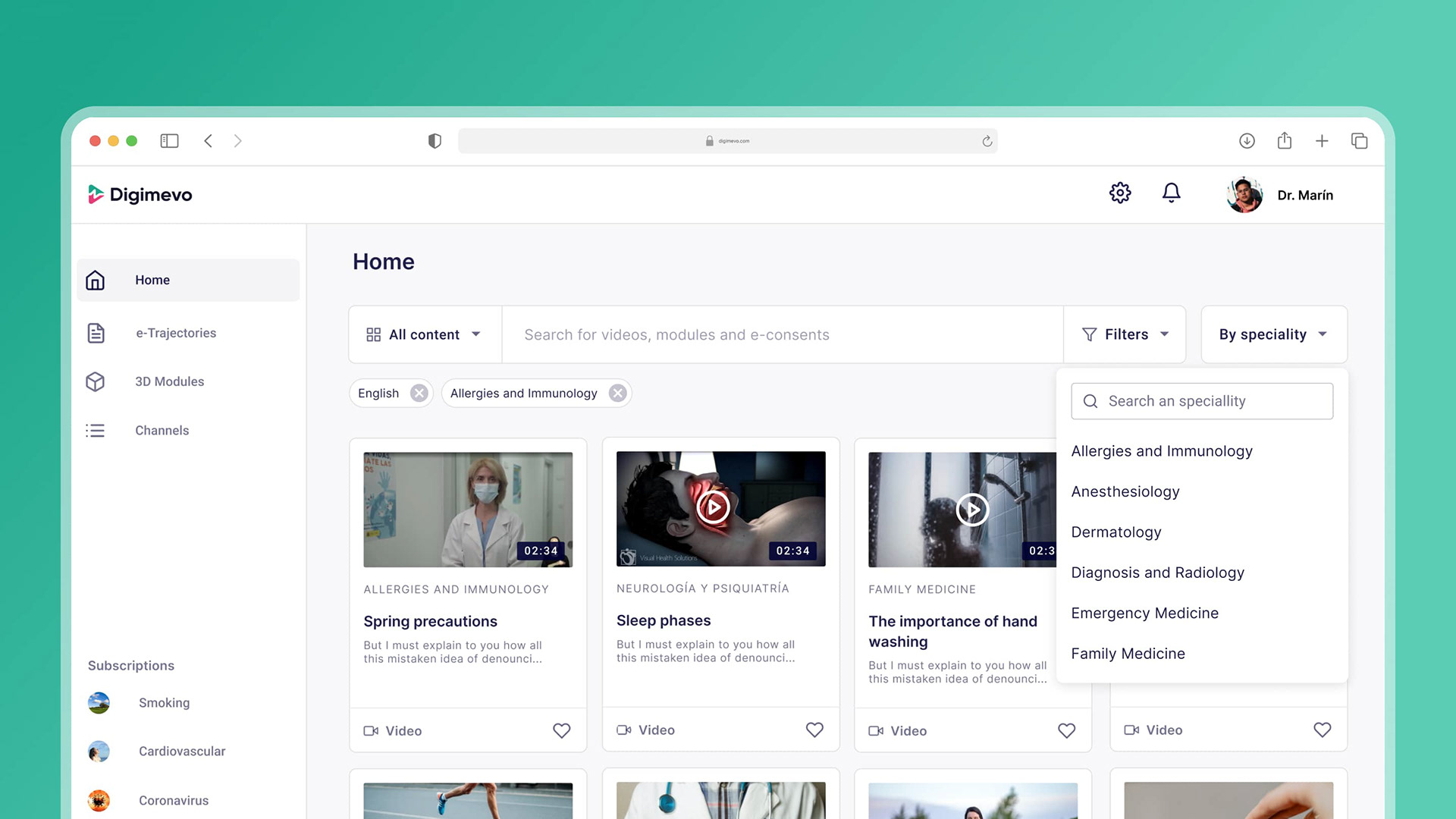
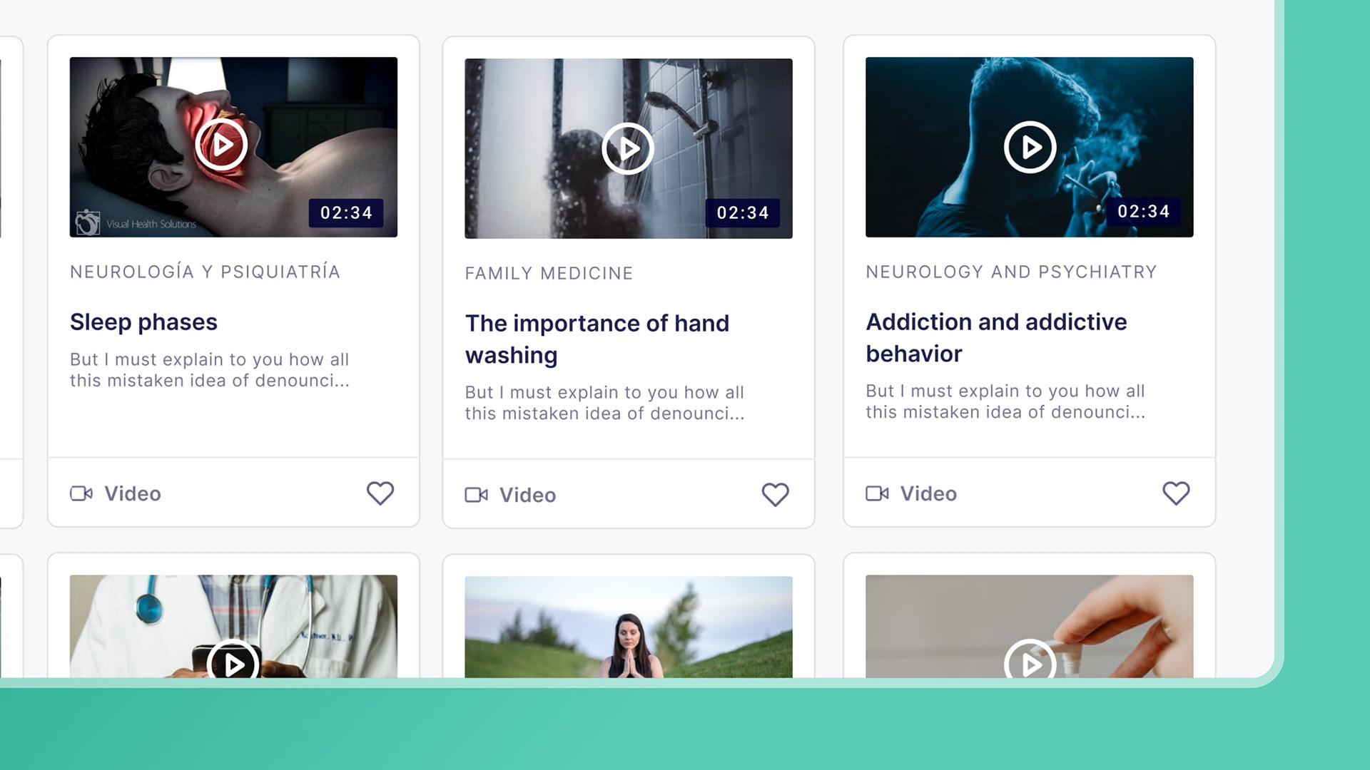
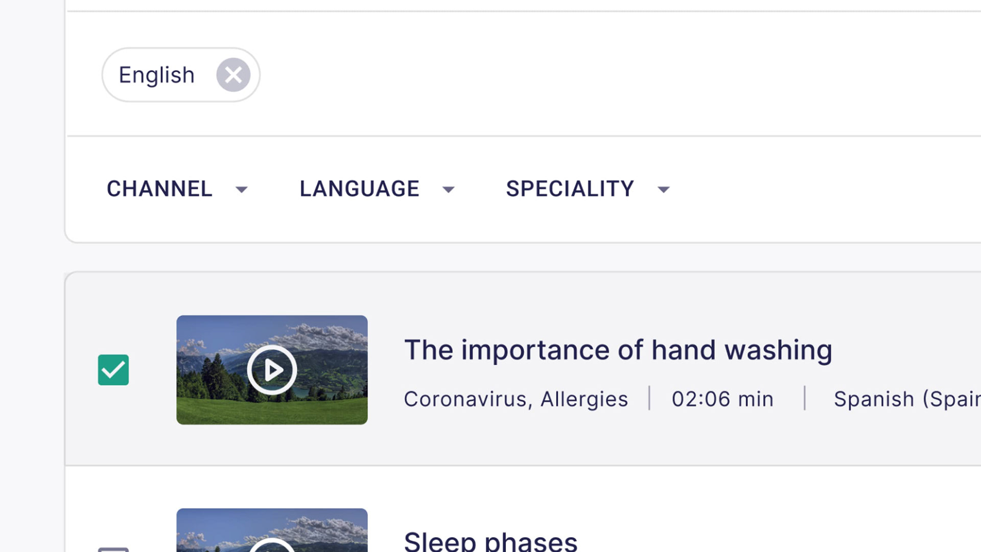
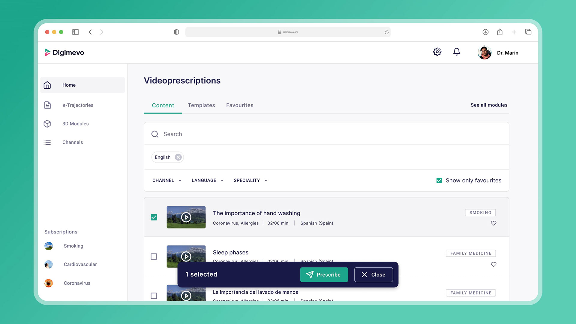
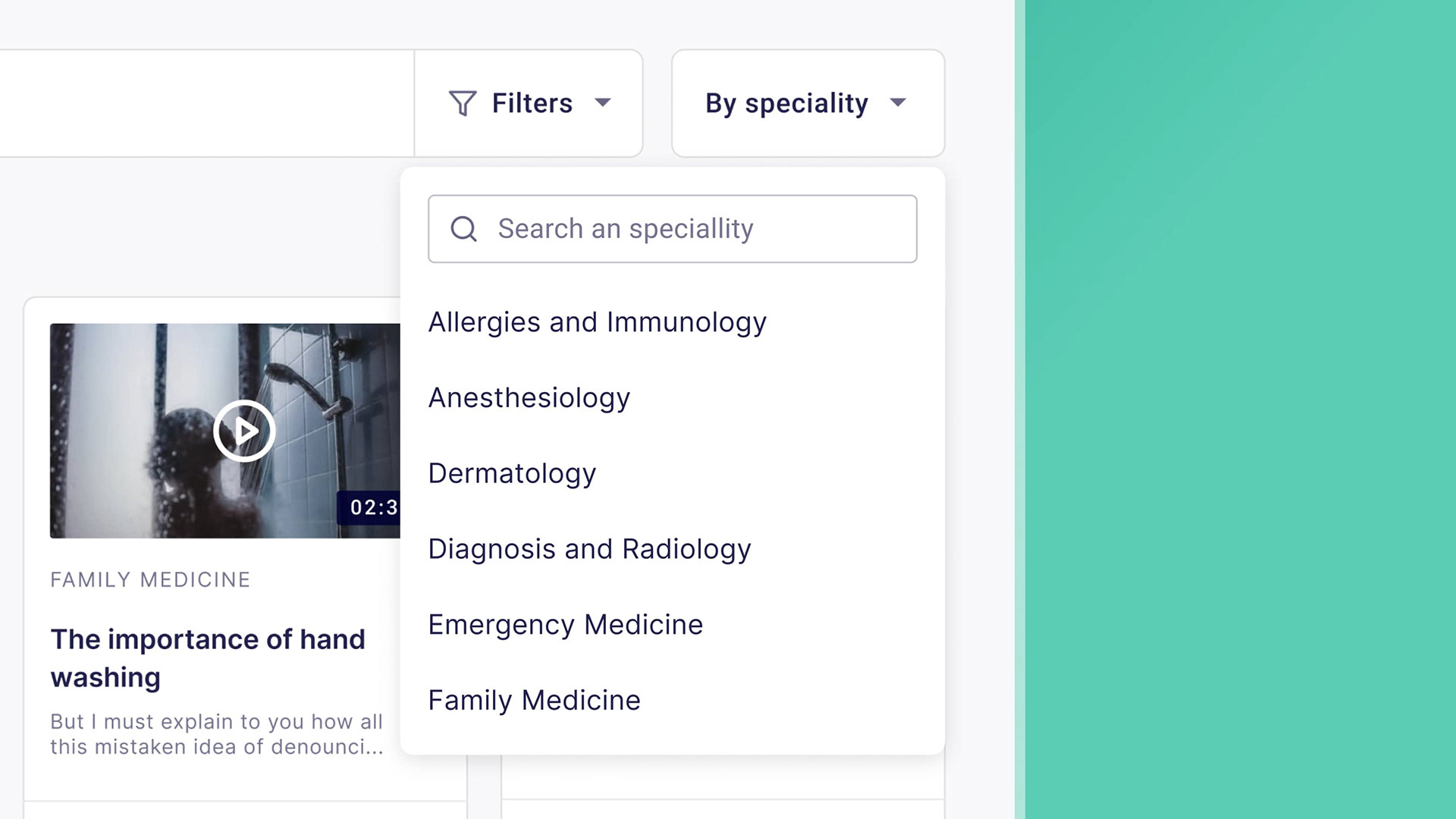
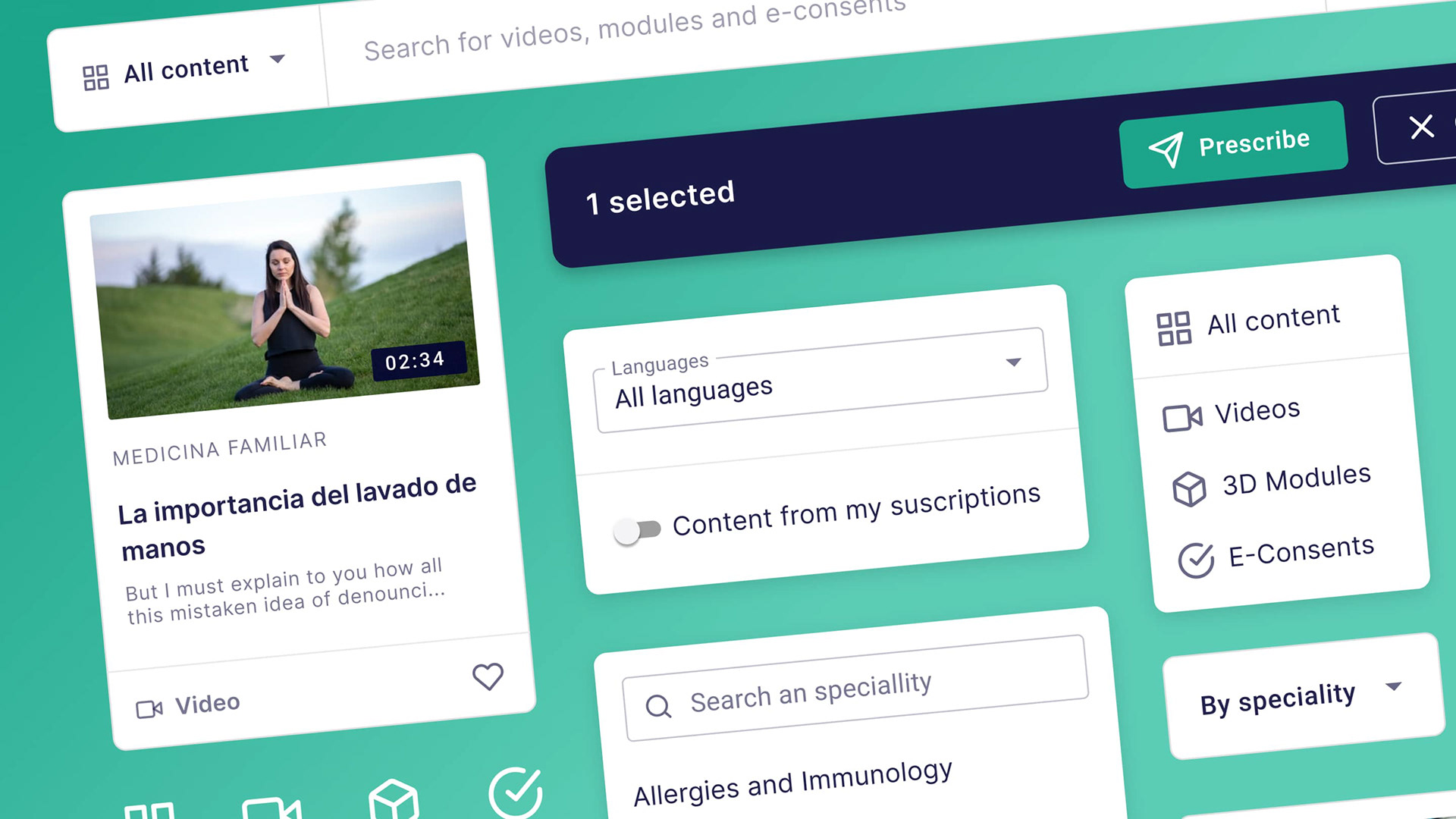
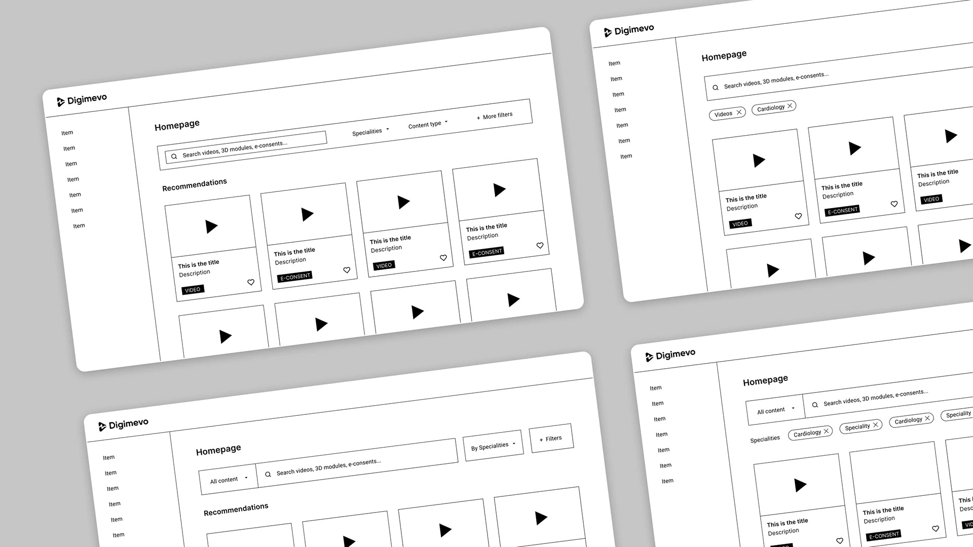
The challenge revolved around discoverability and exploration. Given Digimevo's core identity as a digital content platform, ensuring swift access and seamless exploration of content was crucial. To address this, a user-friendly homepage was introduced, featuring all digital content coupled with easy-to-use filters and the ability to save favorites for future reference. The anticipated result was a boost in app engagement, heightened content consumption, and ultimately an increase in prescription submissions.
Results
Users expressed satisfaction with the newfound ability to seamlessly explore and save content for later use. Additionally, they suggested innovative content formats, such as one-page PDF infographics, to provide patients with quick, concise information without the need for full-length videos
Design Process
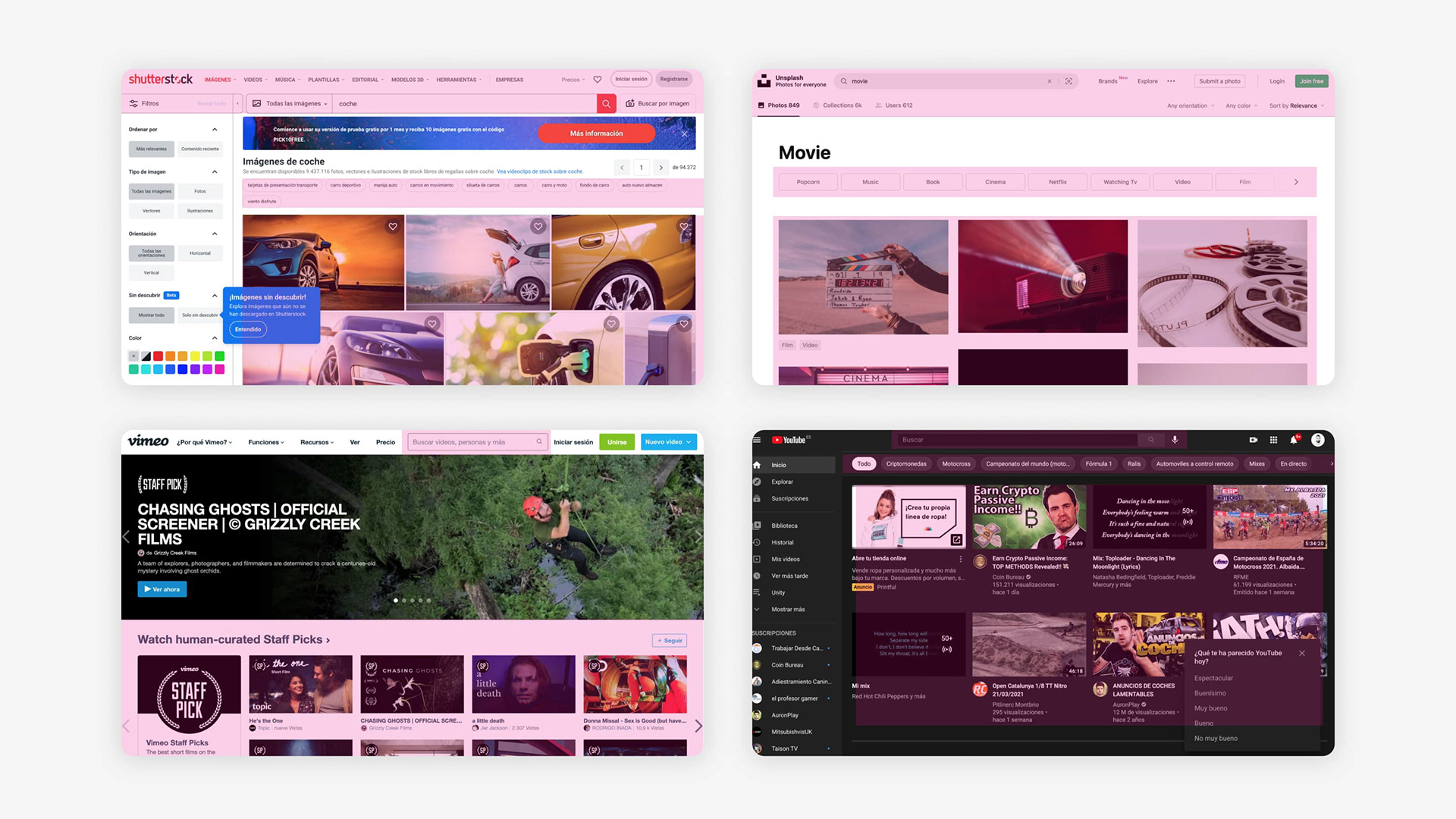
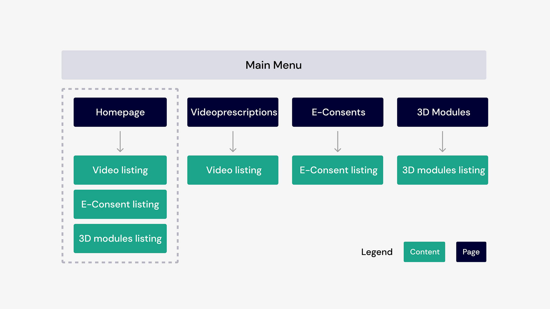
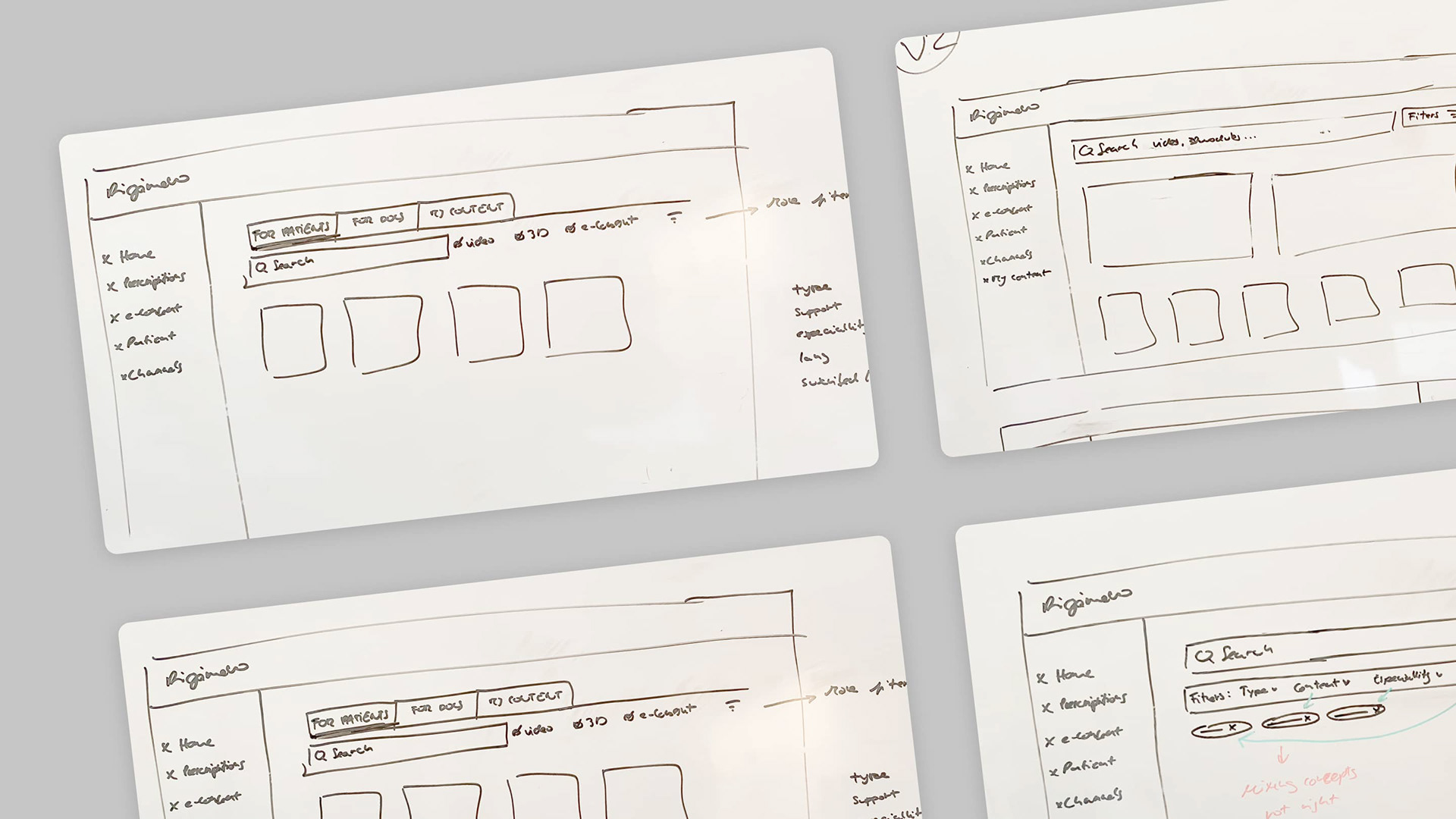
I kicked off the process by delving into our competitors' solutions for insights. Following that, I crafted the information architecture to establish a clear overall picture. Multiple solutions took shape in the form of wireframes and sketches, which I shared with the project manager and engineers. Upon alignment on a specific direction, I proceeded to finalize the visuals and subjected the solution to user testing, conducting interviews with four doctors. Further iterations and collaboration with the team ensued until I reached the point of handing off the project, equipped with user flows and pixel-perfect specifications.
Thank you for reading! 💚