Context
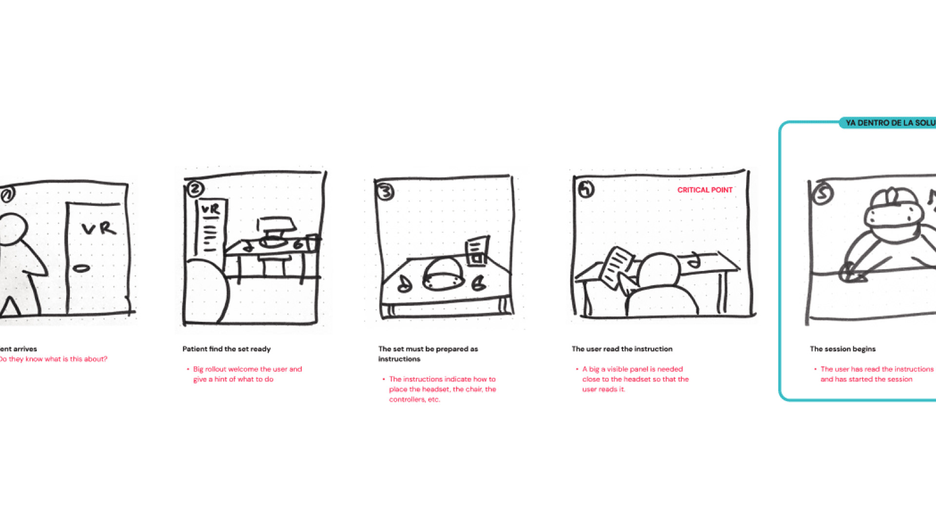
I was commissioned by Digimevo to design a VR experience specifically catering to the relaxation needs of medical professionals. The setup involved placing the experience in a dedicated room, because of that, the onboarding was critical, it would start even before they put the headset on.
The primary aim was to present users with a variety of serene landscapes accompanied by ambient music, creating an immersive environment for observation and relaxation. Addressing the client's, a hospital, request to gauge stress levels, we incorporated a questionnaire. Rather than a traditional form, we implemented a conversational approach using a digital character to facilitate a more engaging user experience.
Design solution
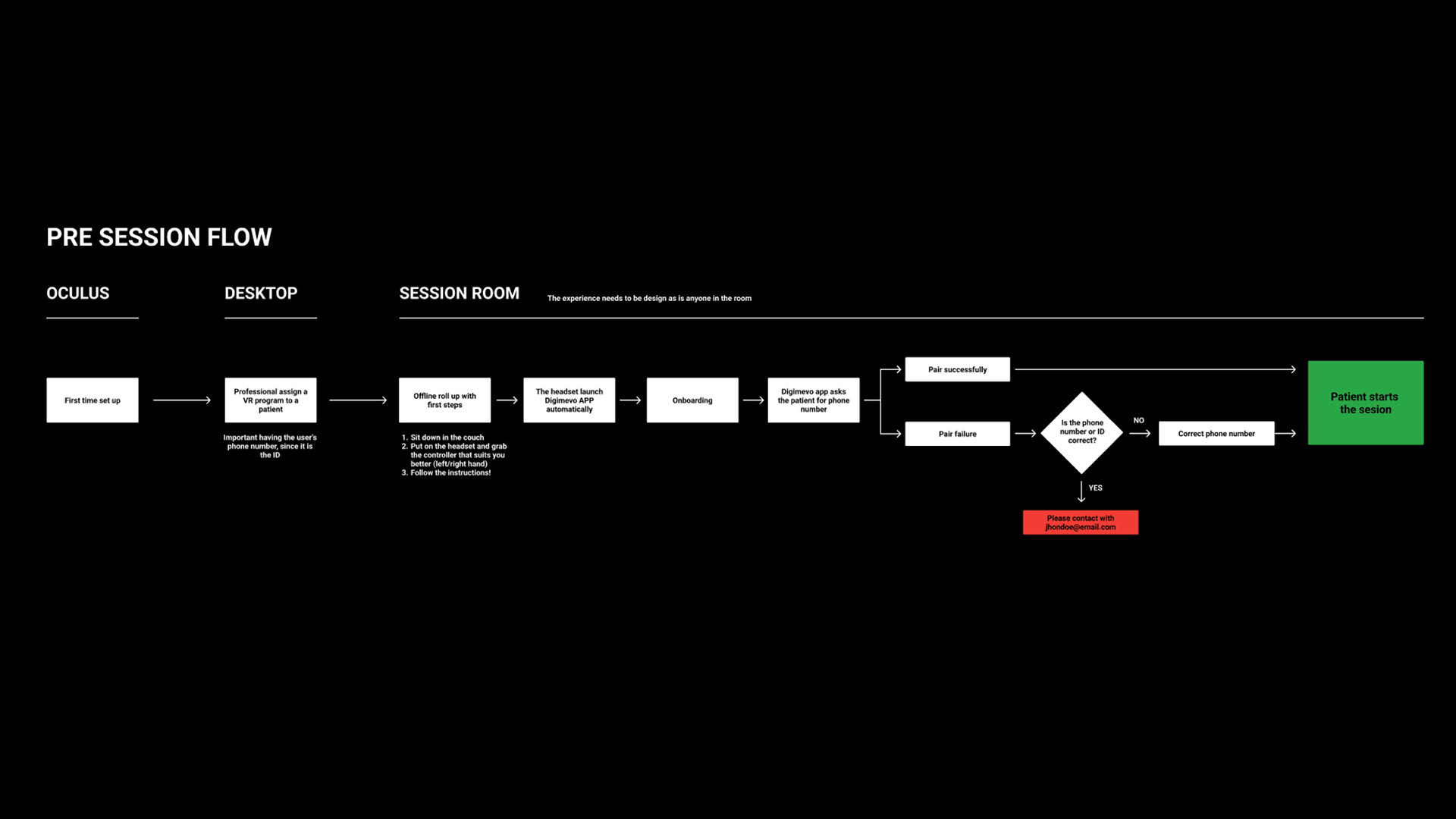
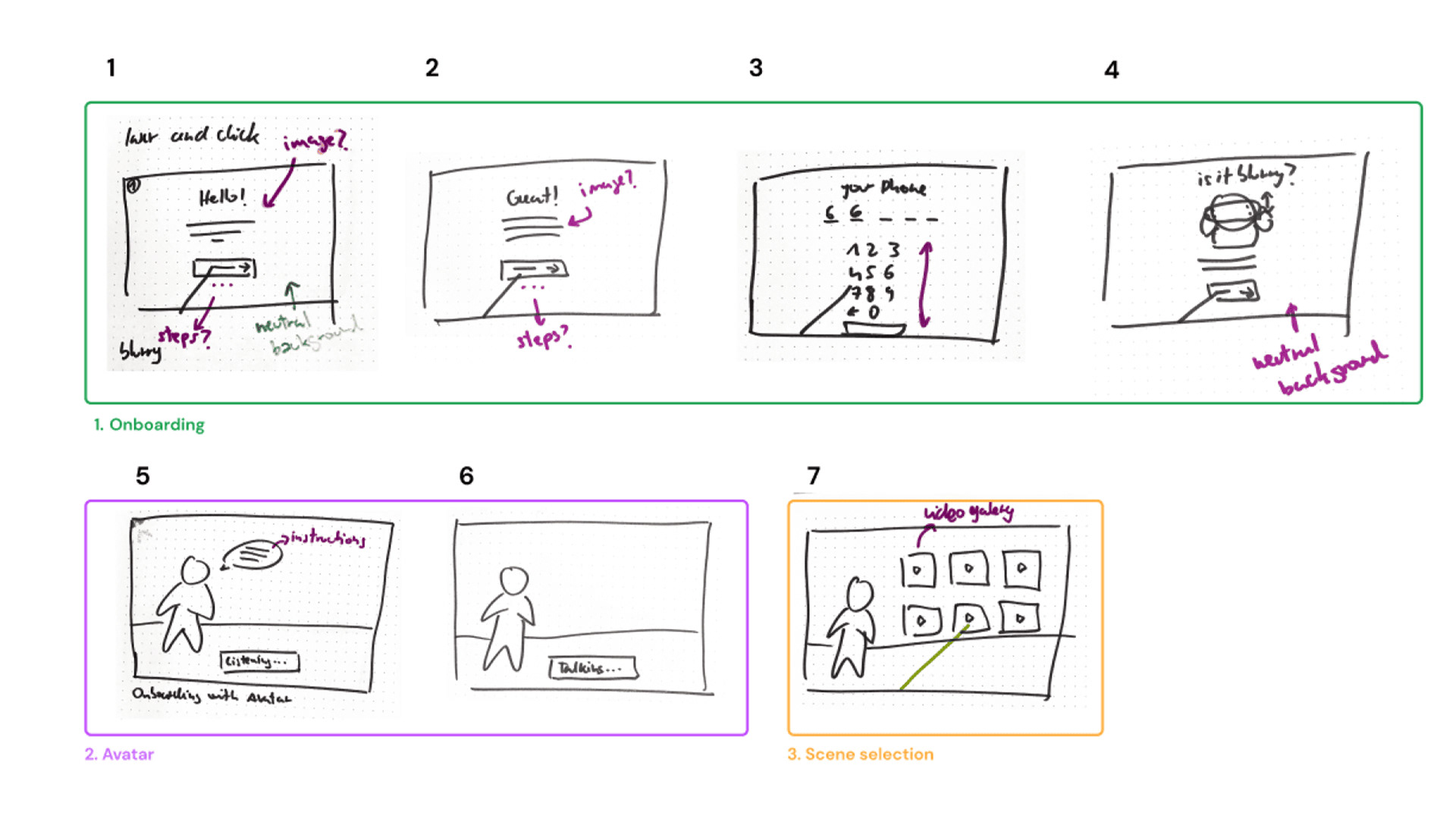
To cater to users unfamiliar with VR headsets, the proposed solution began with a printed guide located beside the headset, offering clear instructions for initiating the experience. Following this, already in the headset, an onboarding sequence was displayed to guide users on navigation. The process then moved to user identification and initiation of conversations with the digital avatar.
Upon completion, a grid featuring thumbnails of various landscapes was presented, allowing users to select their preferred landscape. Post each session, the application initiated a Net Promoter Score (NPS) evaluation to assess satisfaction with the experience. This structured flow aimed at ensuring a smooth introduction, navigation, and interaction for users, particularly those new to VR technology.
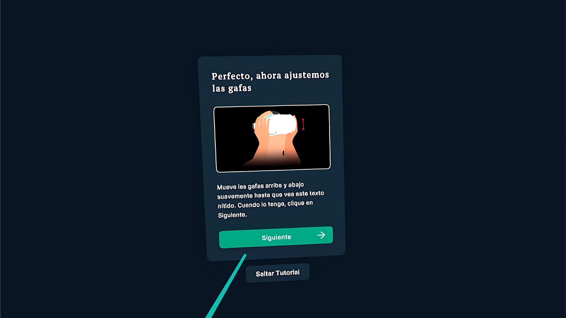
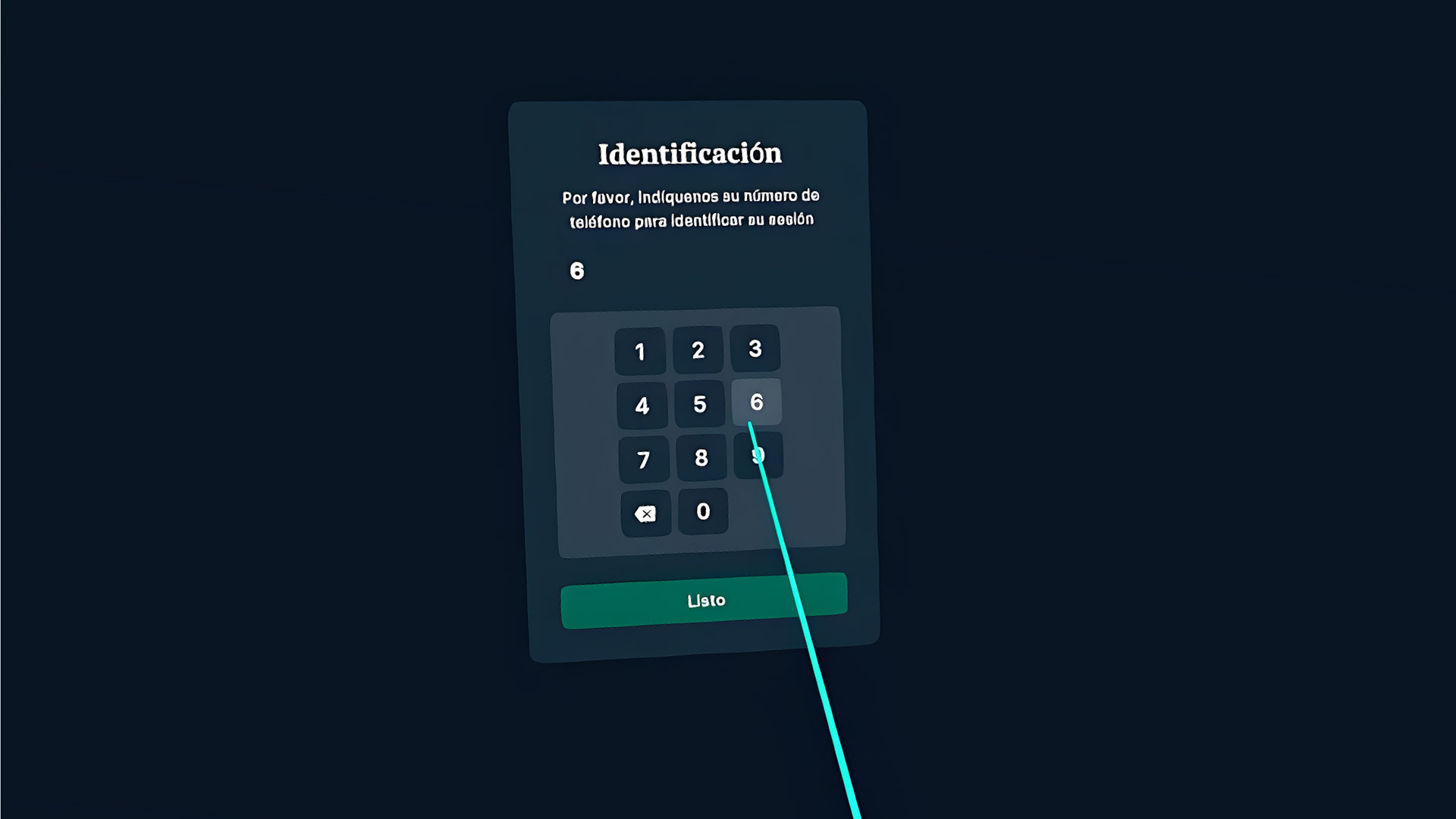
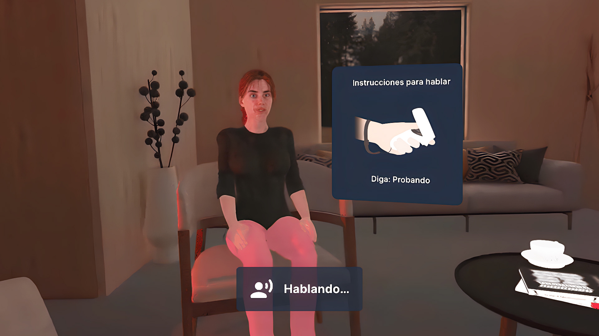
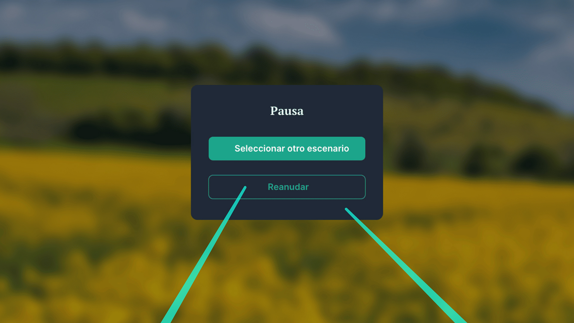
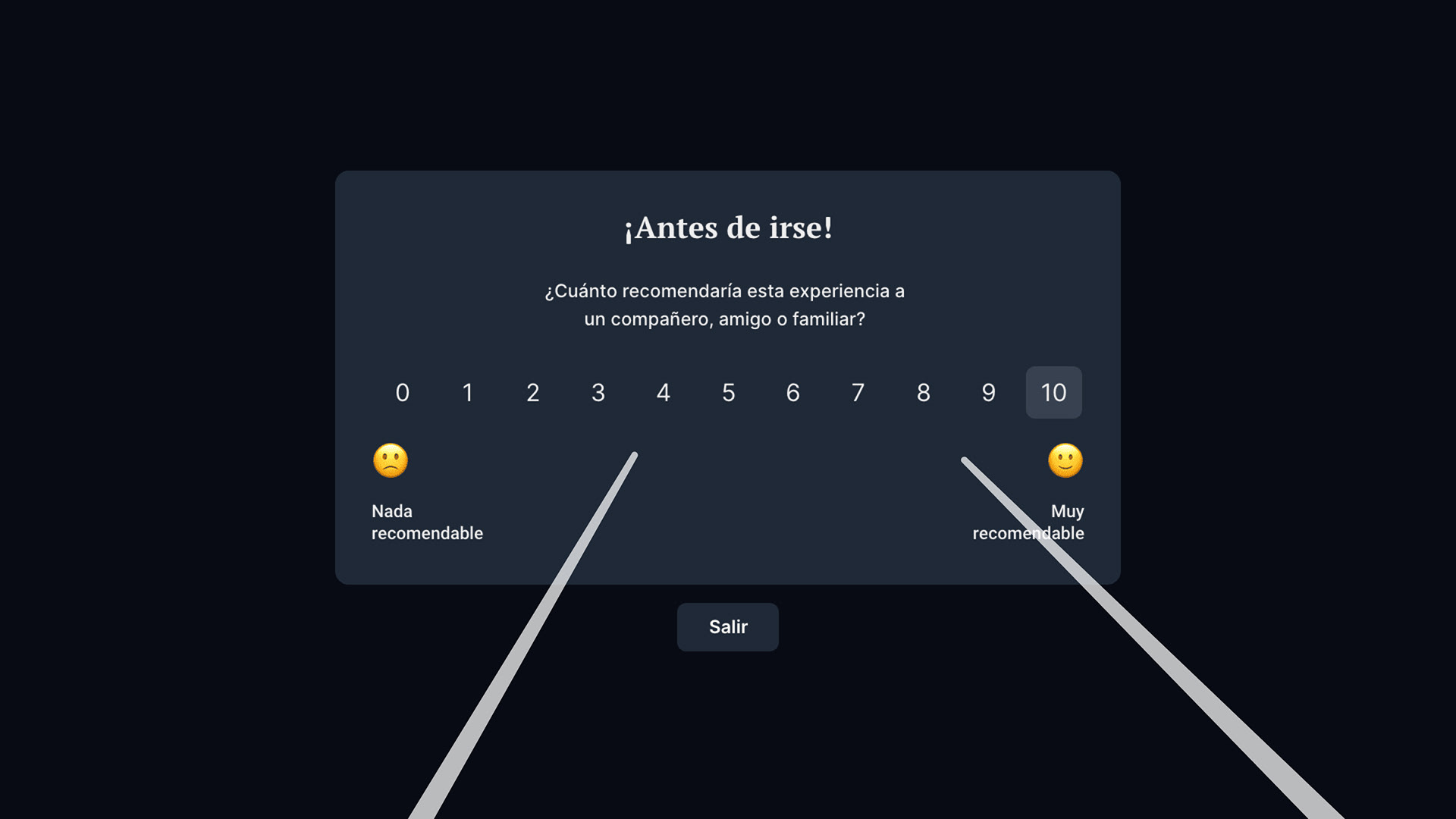
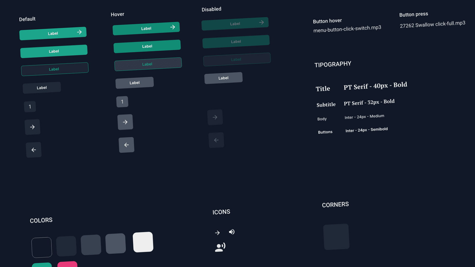
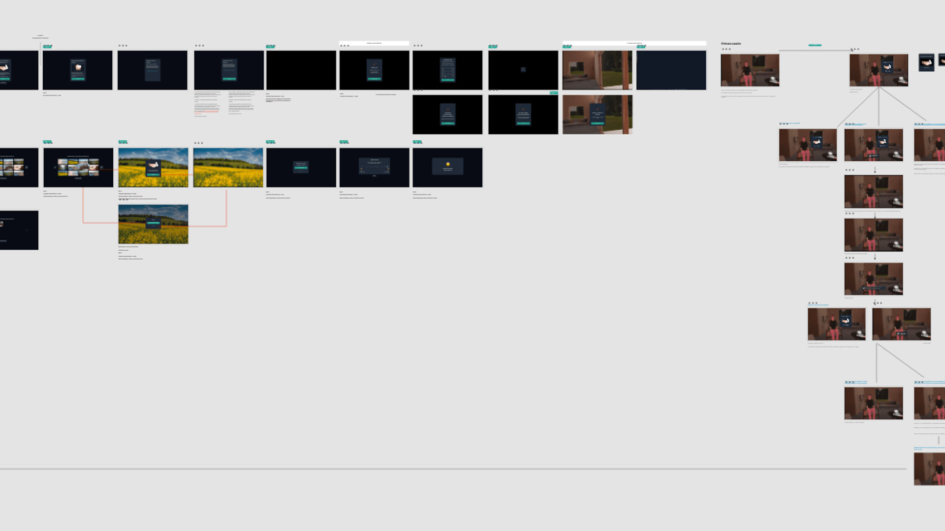
Full experience from the onboarding to the NPS
Process
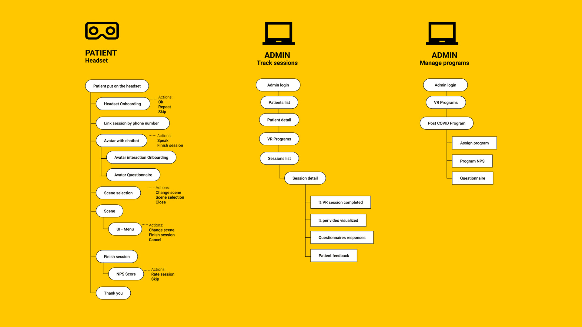
The project initiation involved comprehensive information gathering to understand the client's problem and ensure goal alignment. Subsequently, I focused on establishing a solid information architecture and logical framework, clarifying the path for both in and out-of-headset experiences. Following this, I crafted a user flow to ensure satisfaction with the overall journey.
Collaboration with 3D artists and developers came next, aligning their expertise with the established framework. With a clear foundation, I transitioned to high-fidelity layouts and UI design. To refine the user experience, especially during interactions with the avatar, I conducted four rounds of user testing, iterating the solution based on valuable insights.
The final phase involved implementing a tracking mechanism within the experience, incorporating a Net Promoter Score (NPS) to gauge user satisfaction.
Results
The client expressed satisfaction with the app and positive user feedback. Encouraged by its success, they requested additional features to enhance the application's functionality. Specifically, the client desired the capability to observe sessions in real-time from a computer and expressed interest in having the autonomy to create questionnaires independently. This positive response and the client's eagerness for expanded features demonstrated the app's effectiveness and its potential for further customization to meet evolving needs.
Thank you for watching 💚