Context
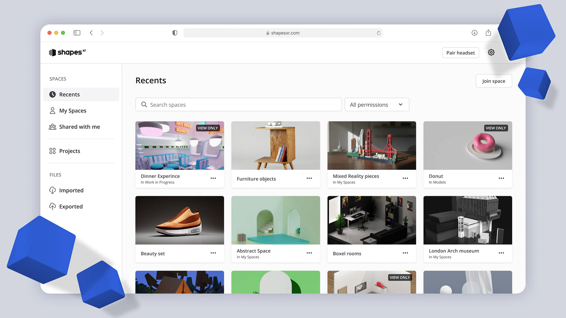
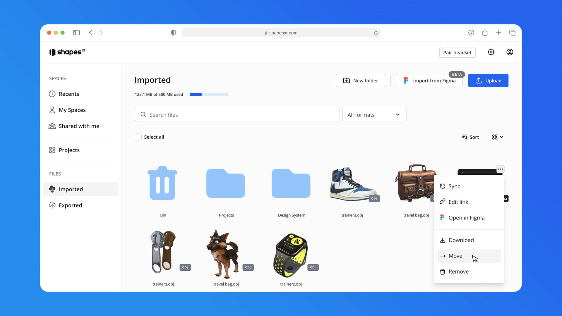
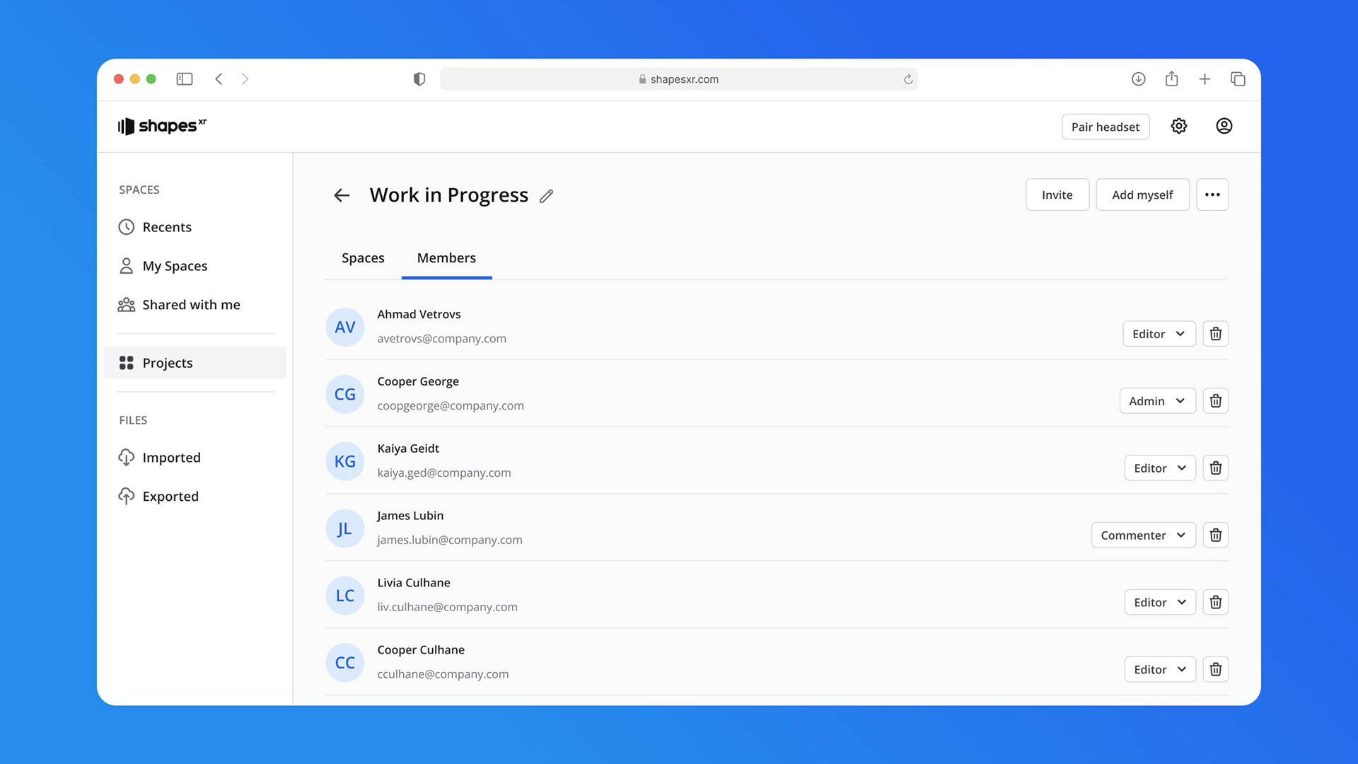
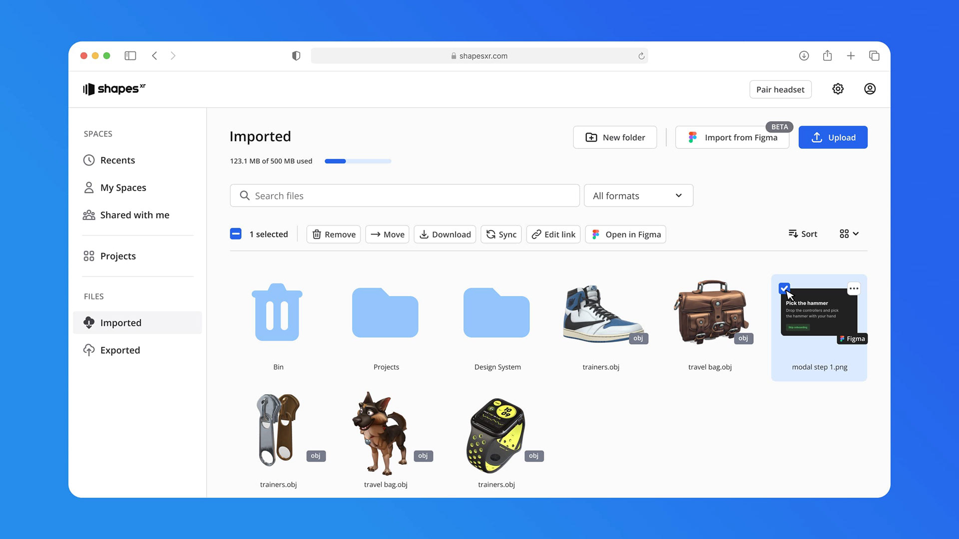
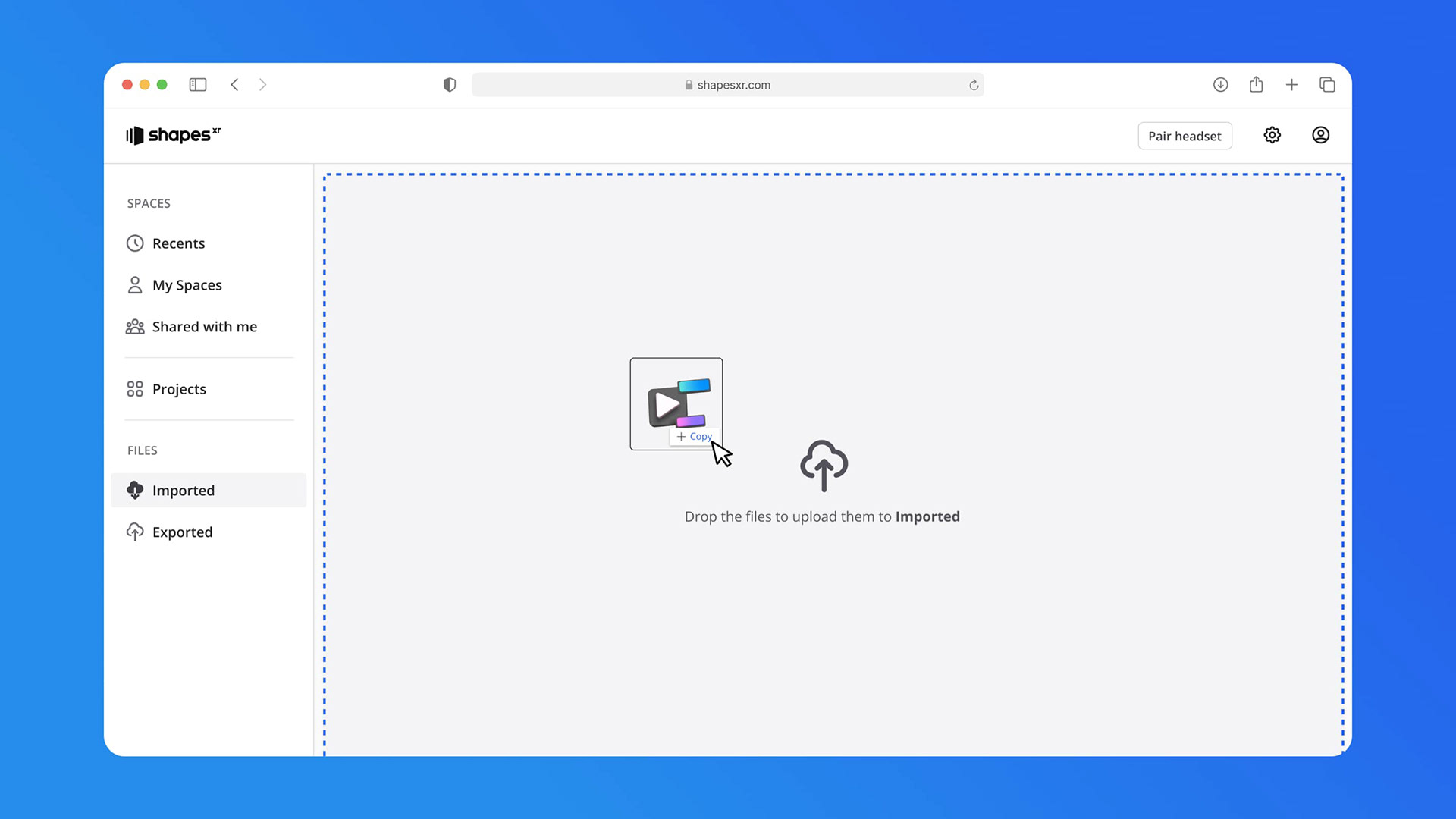
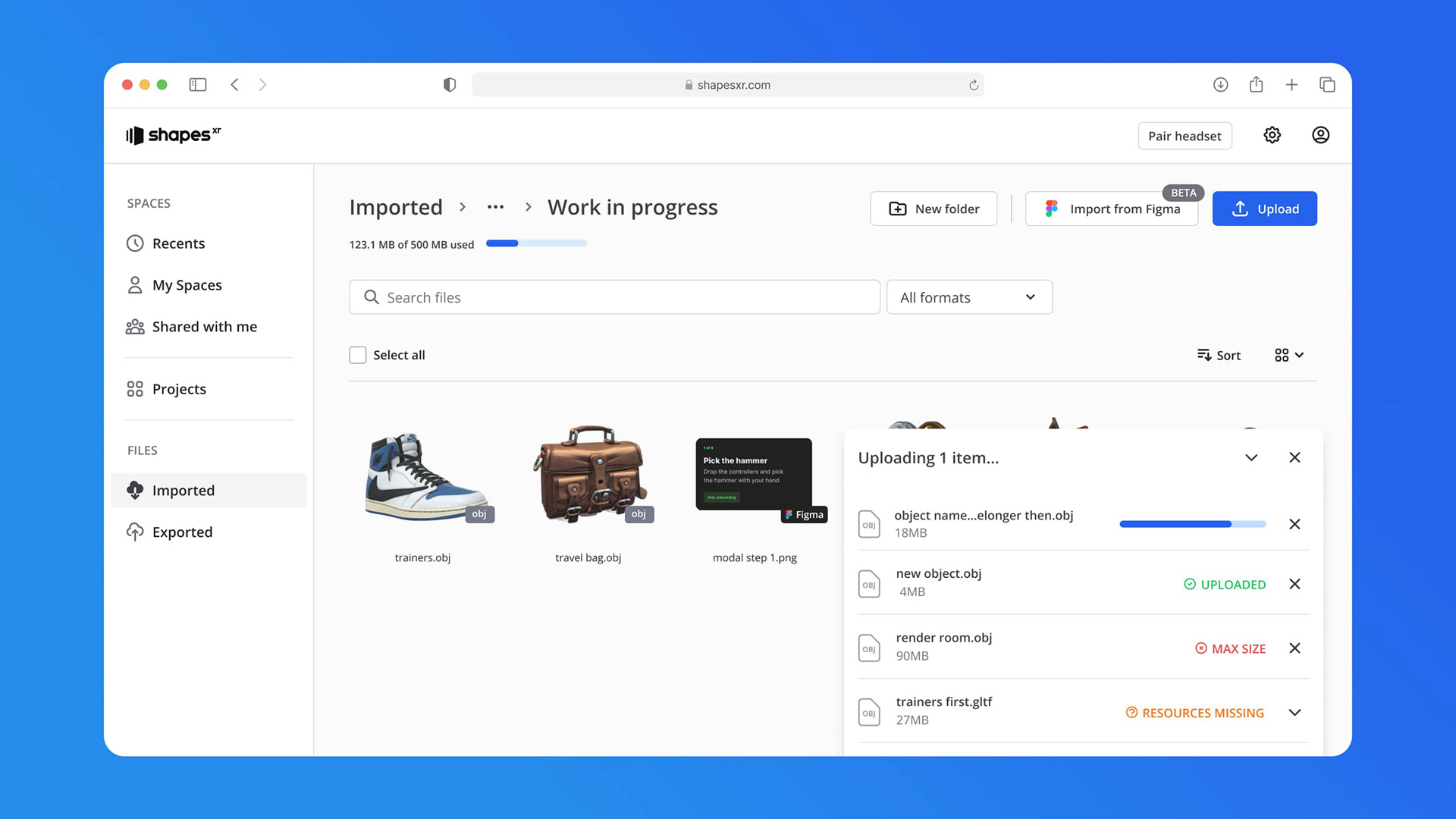
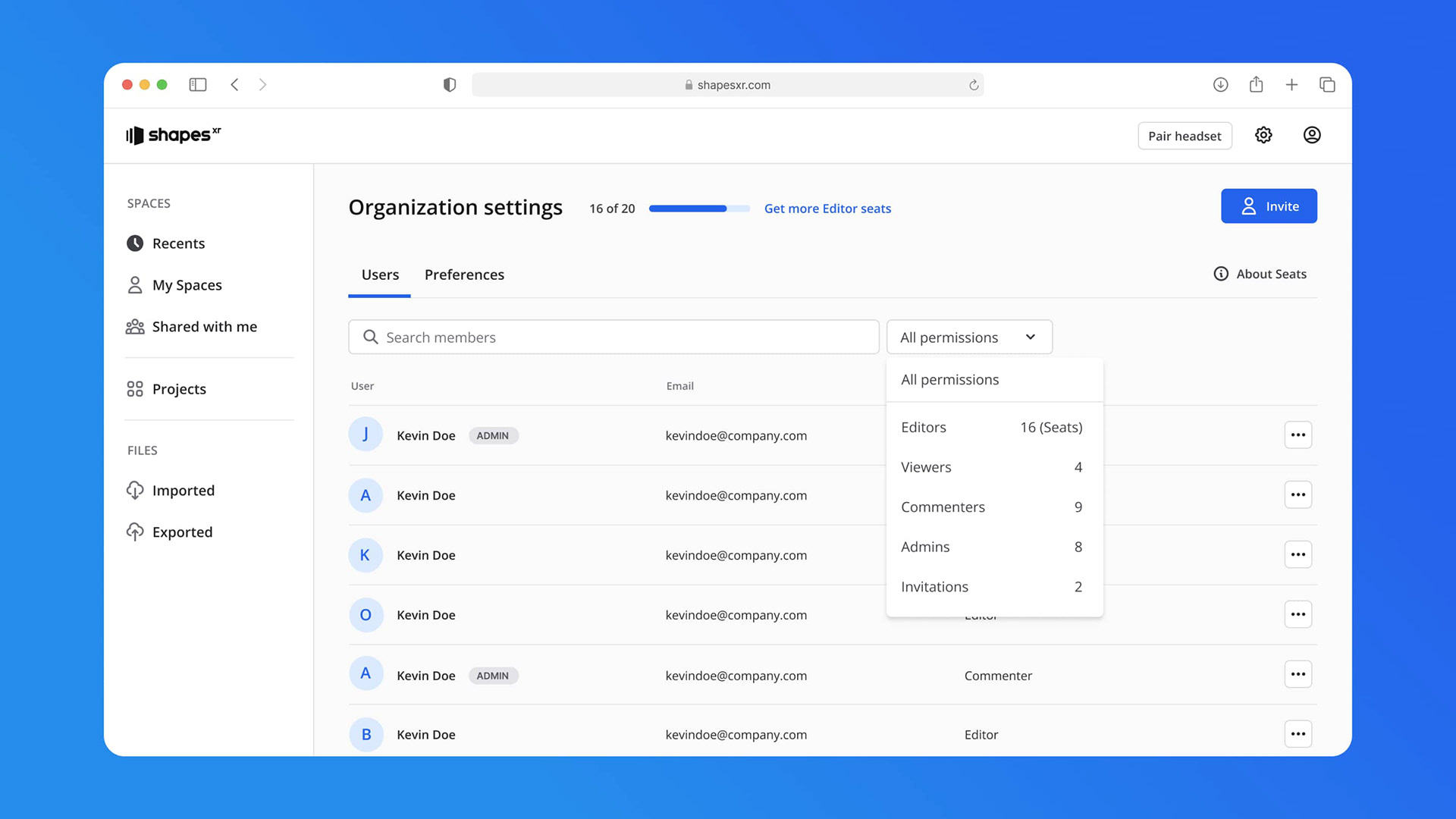
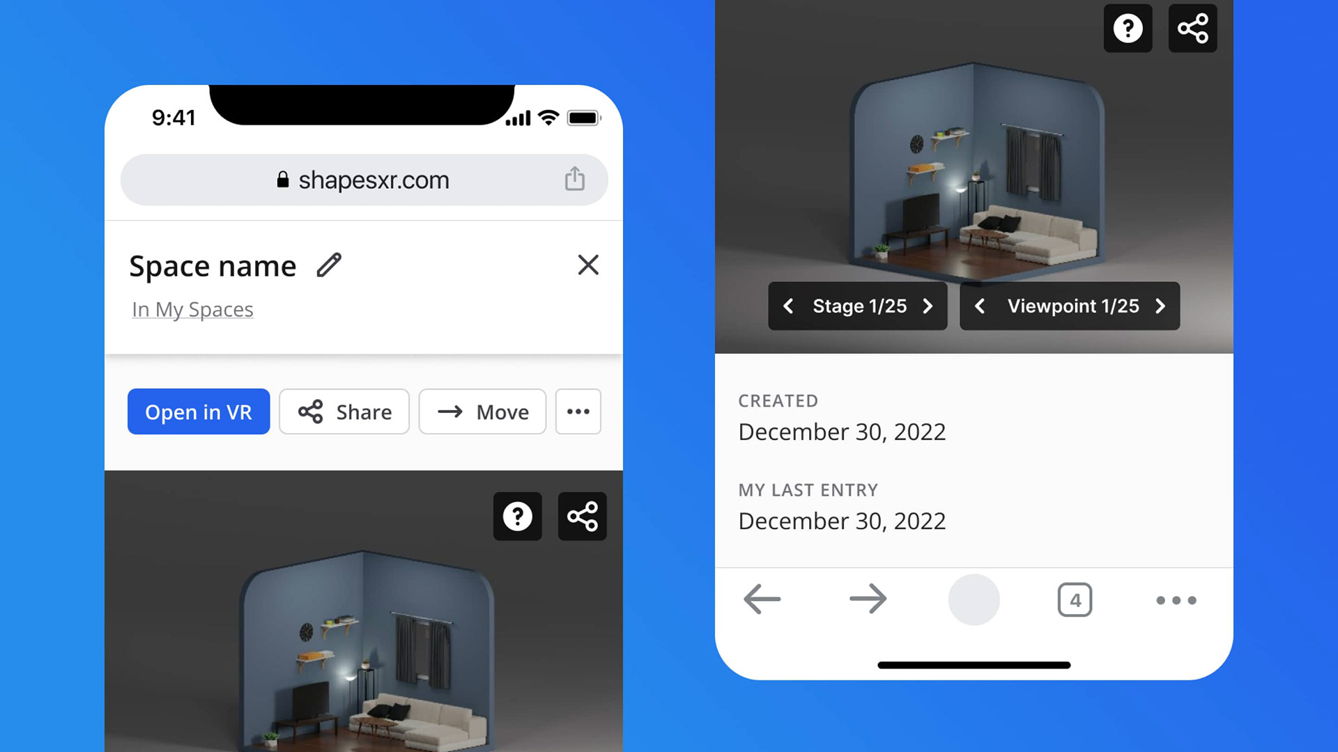
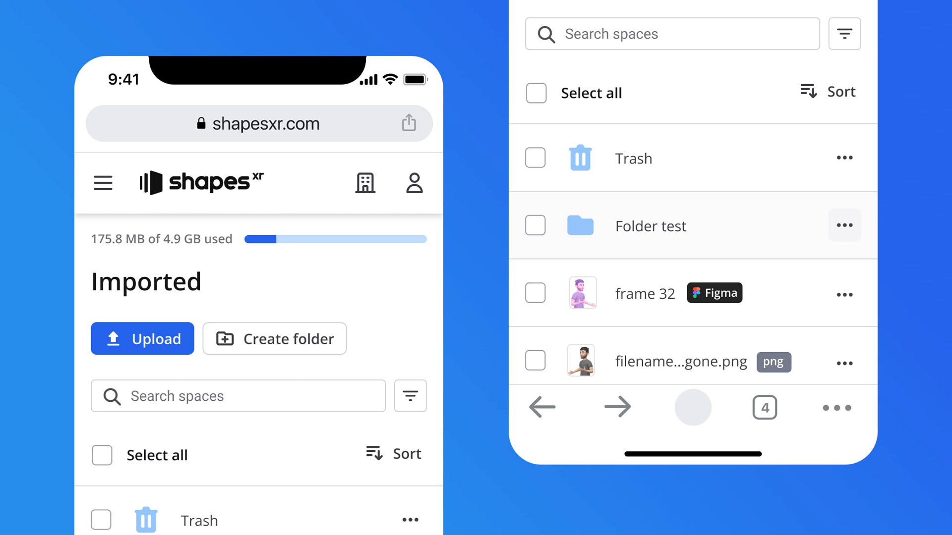
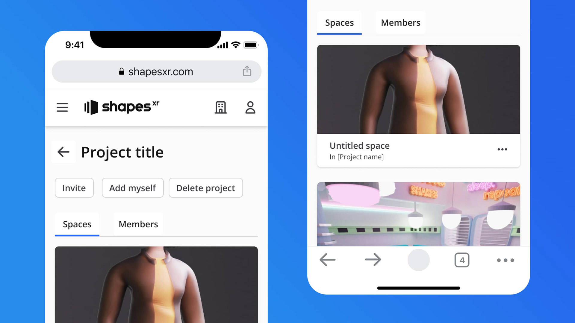
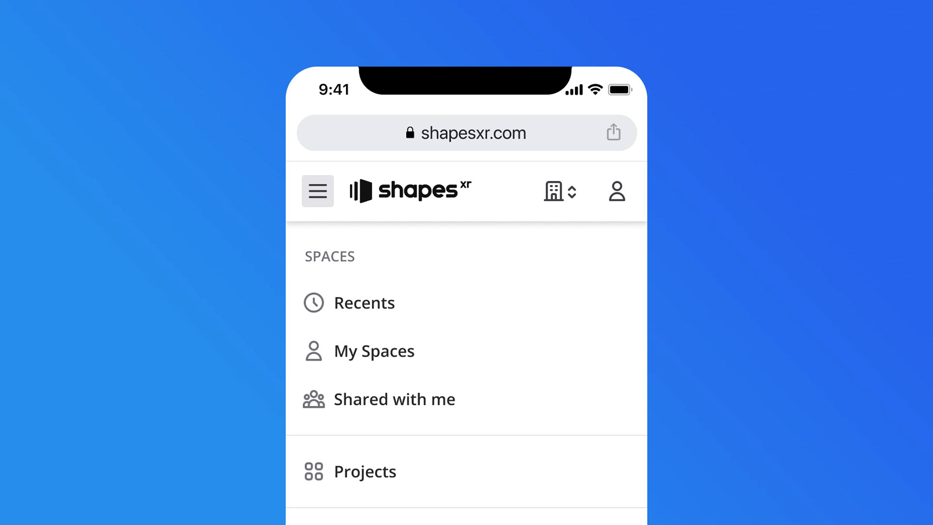
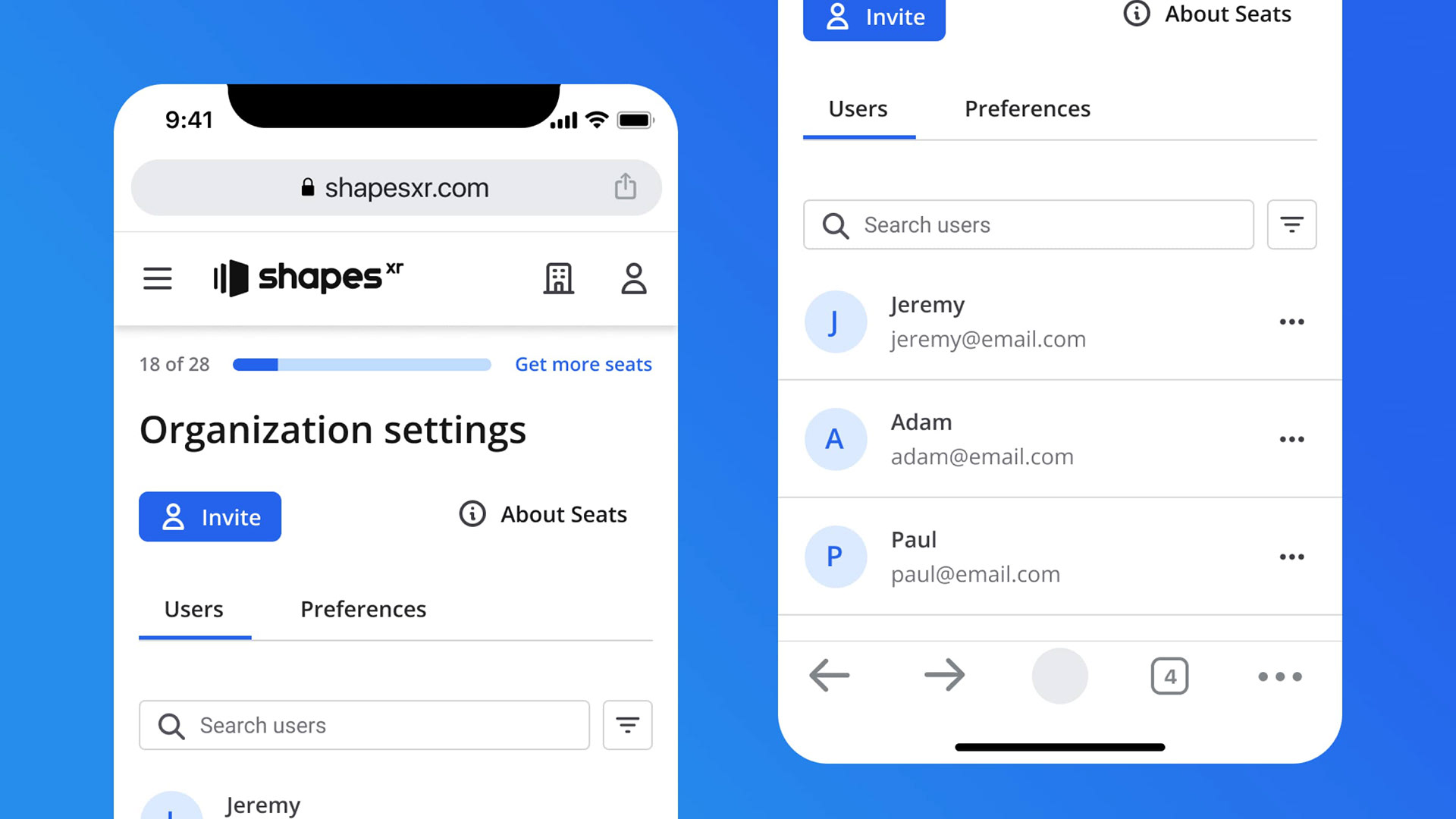
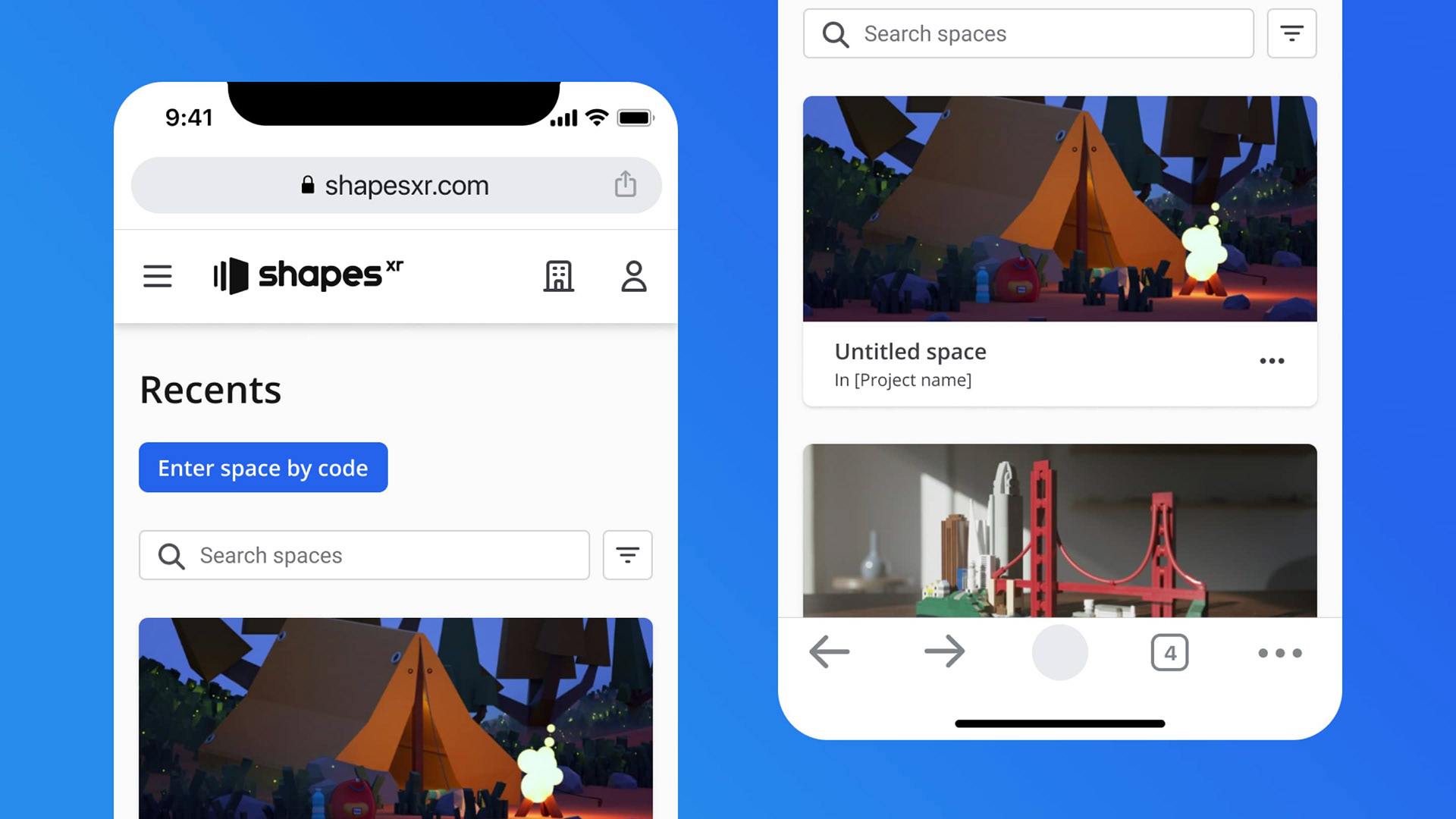
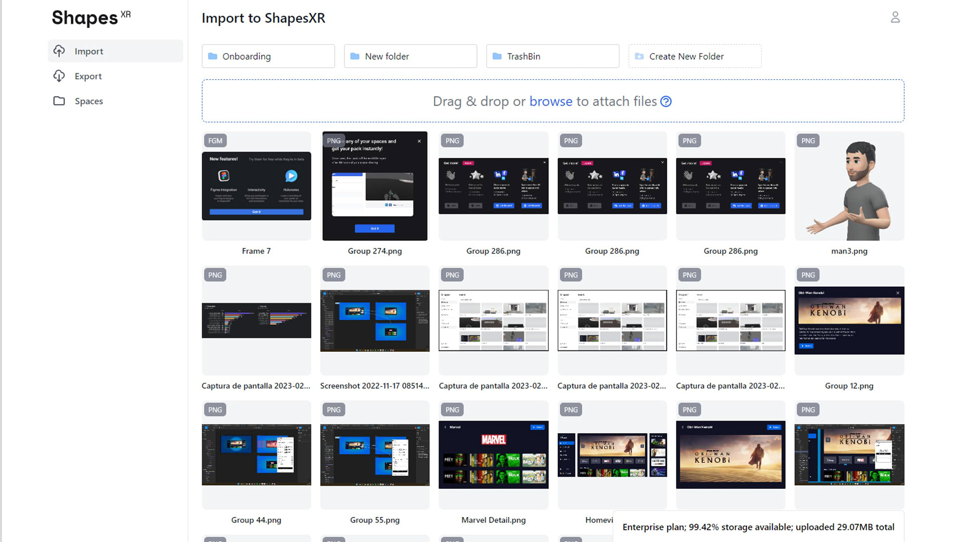
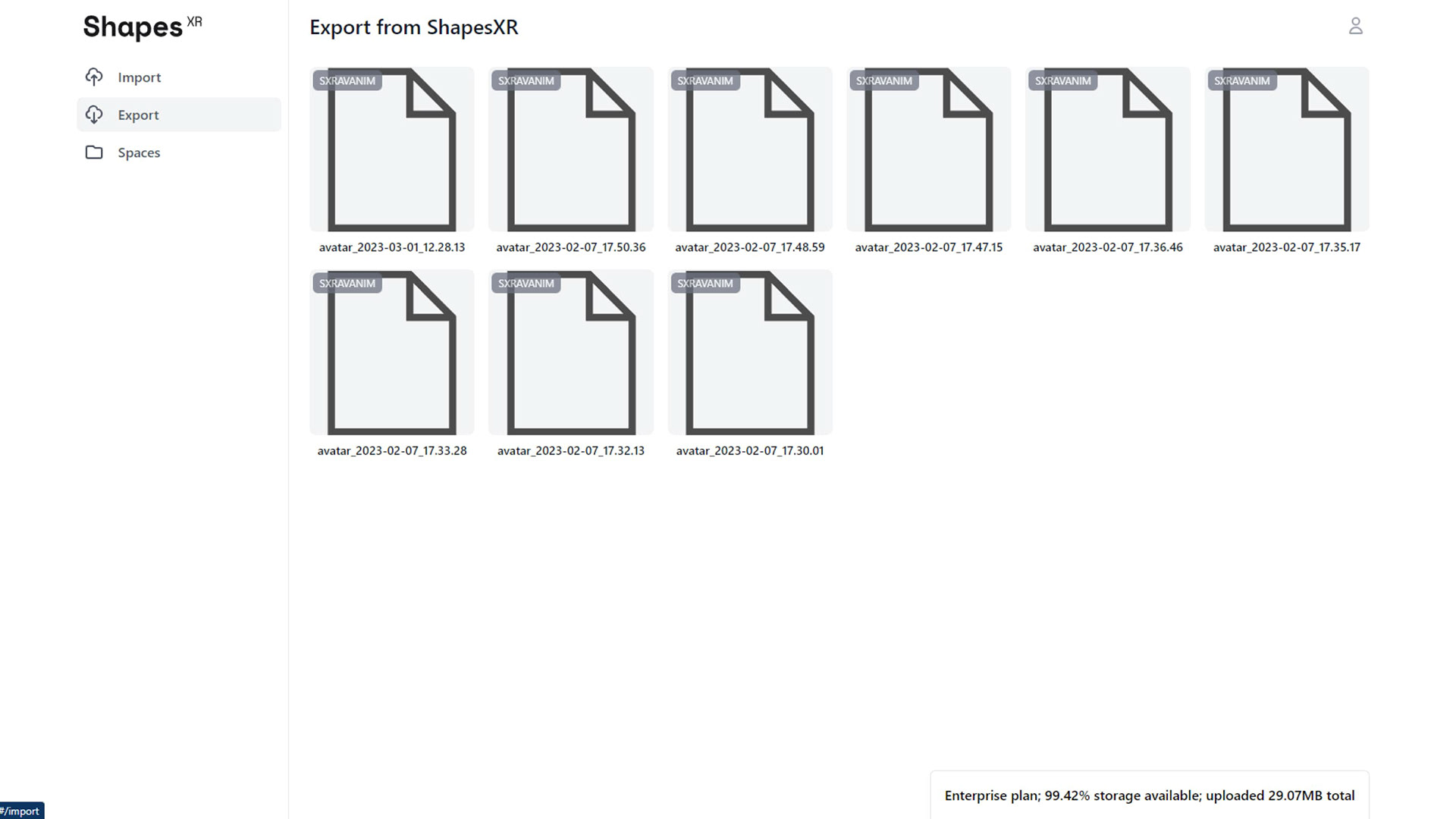
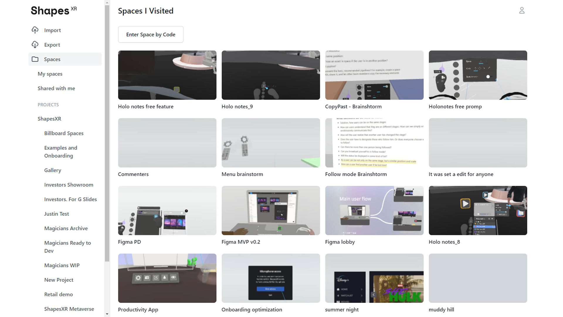
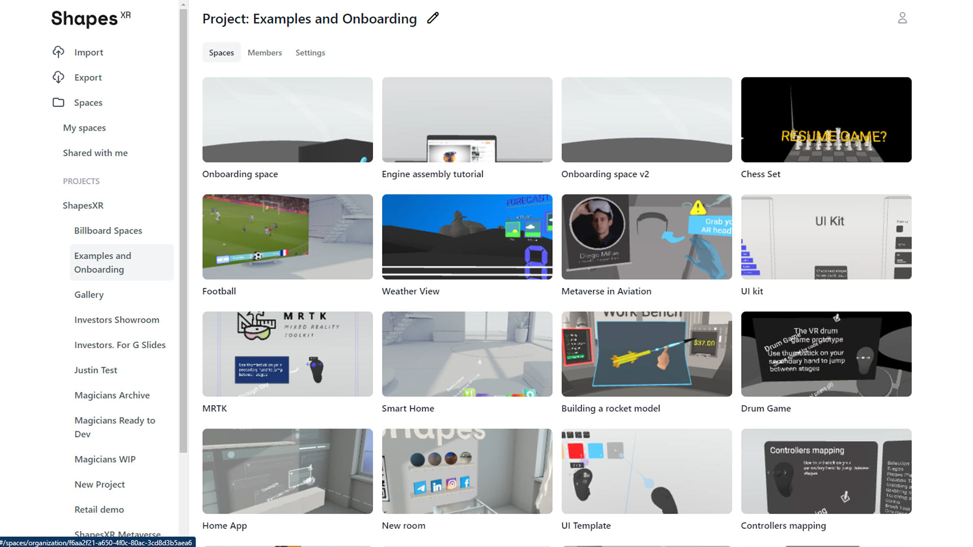
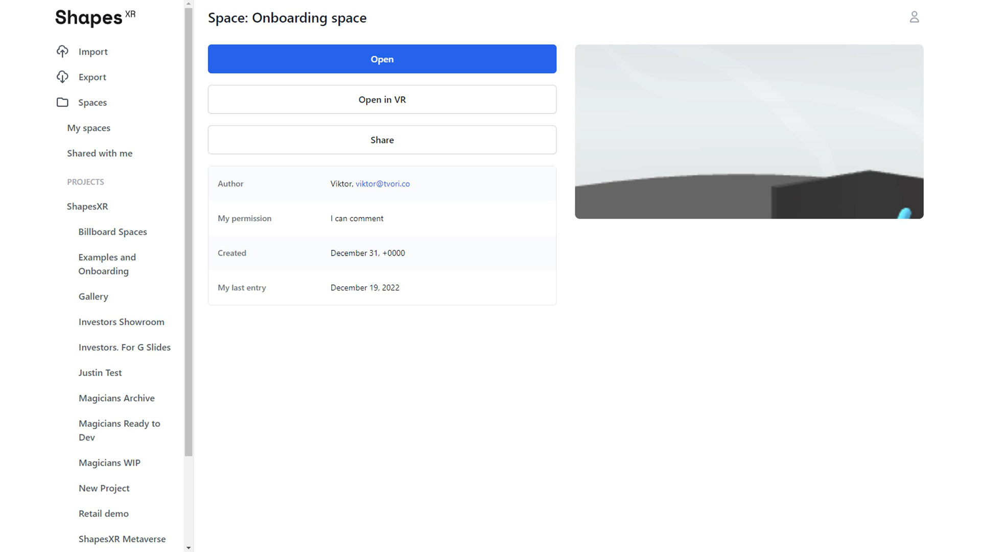
ShapesXR is a VR design tool, often referred to as the Figma for VR apps. As a part of its workflow, ShapesXR allows users to manage their projects on the web. This web application, or Dashboard, also enables users to import 3D models or images into their projects for use in the VR app. Additionally, it provides features for organizing projects, setting roles and permissions, and managing both organizational and personal accounts.
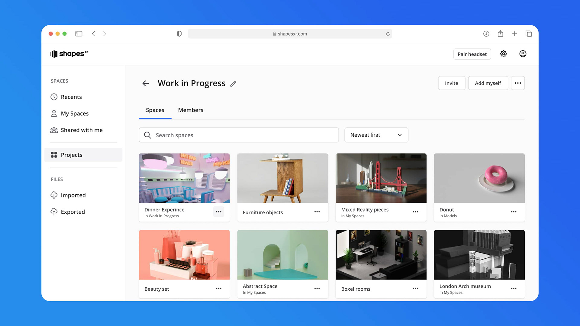
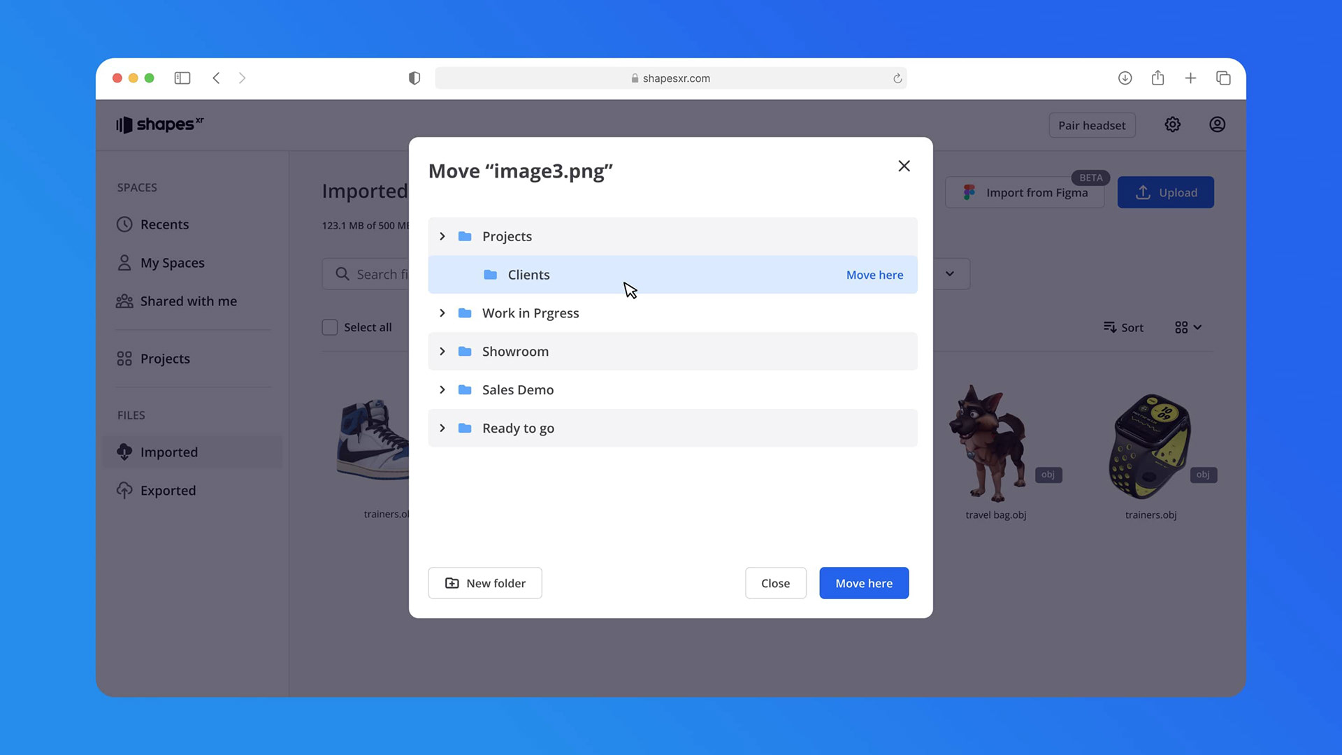
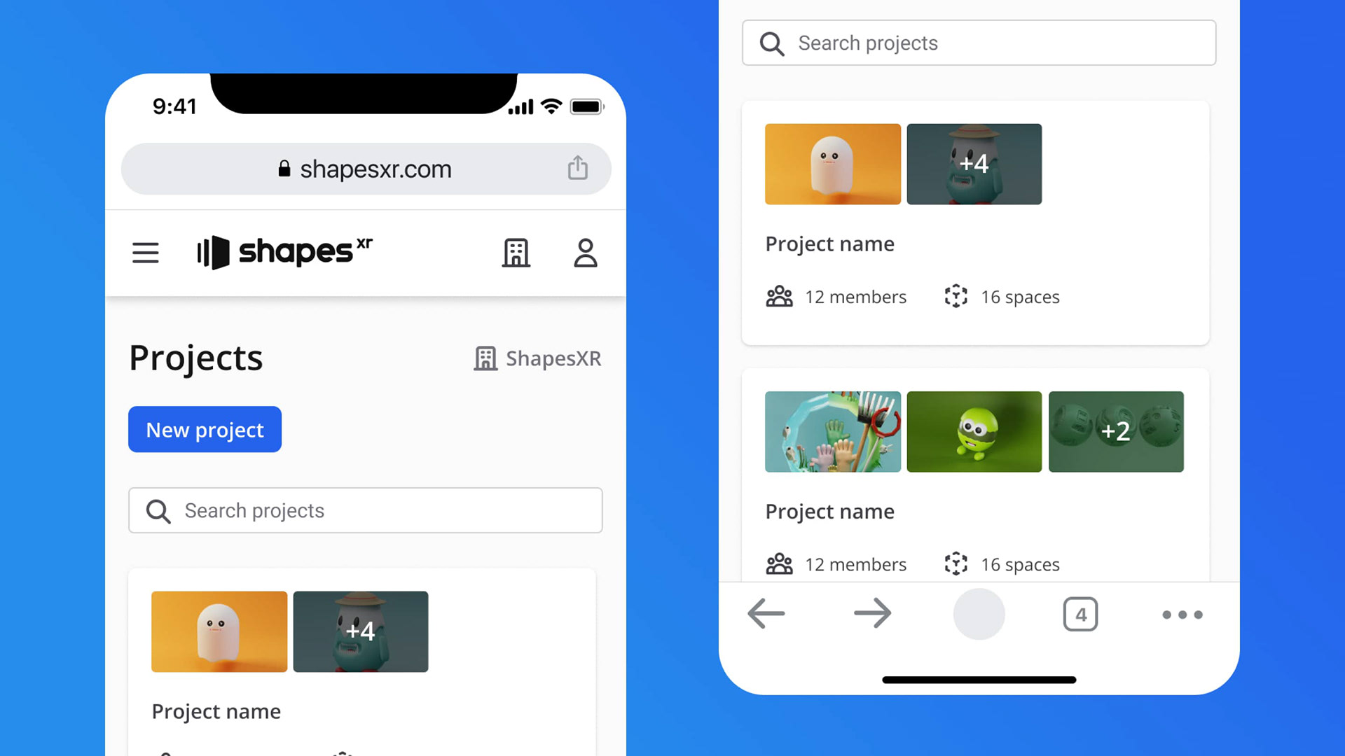
For this project, I was assigned the task of redesigning the Dashboard. The original Dashboard exhibited several UX and UI issues, including a complex flow for updating files, core sections like Projects hidden in the main menu, the absence of a UI design system, and a subpar mobile experience.
This redesign initiative aimed to address these concerns and enhance the overall usability of the platform.
Design Solution
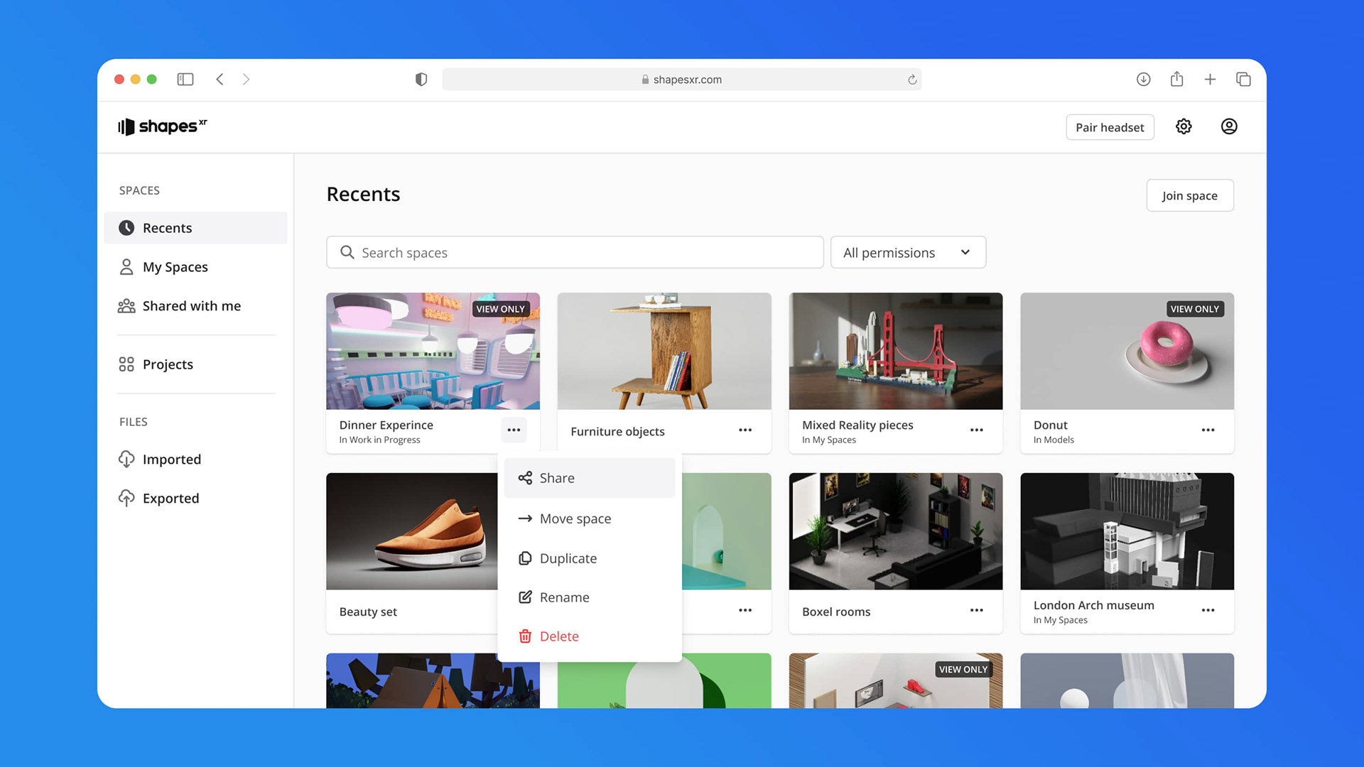
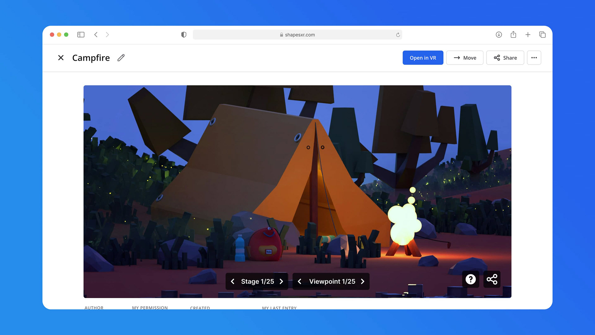
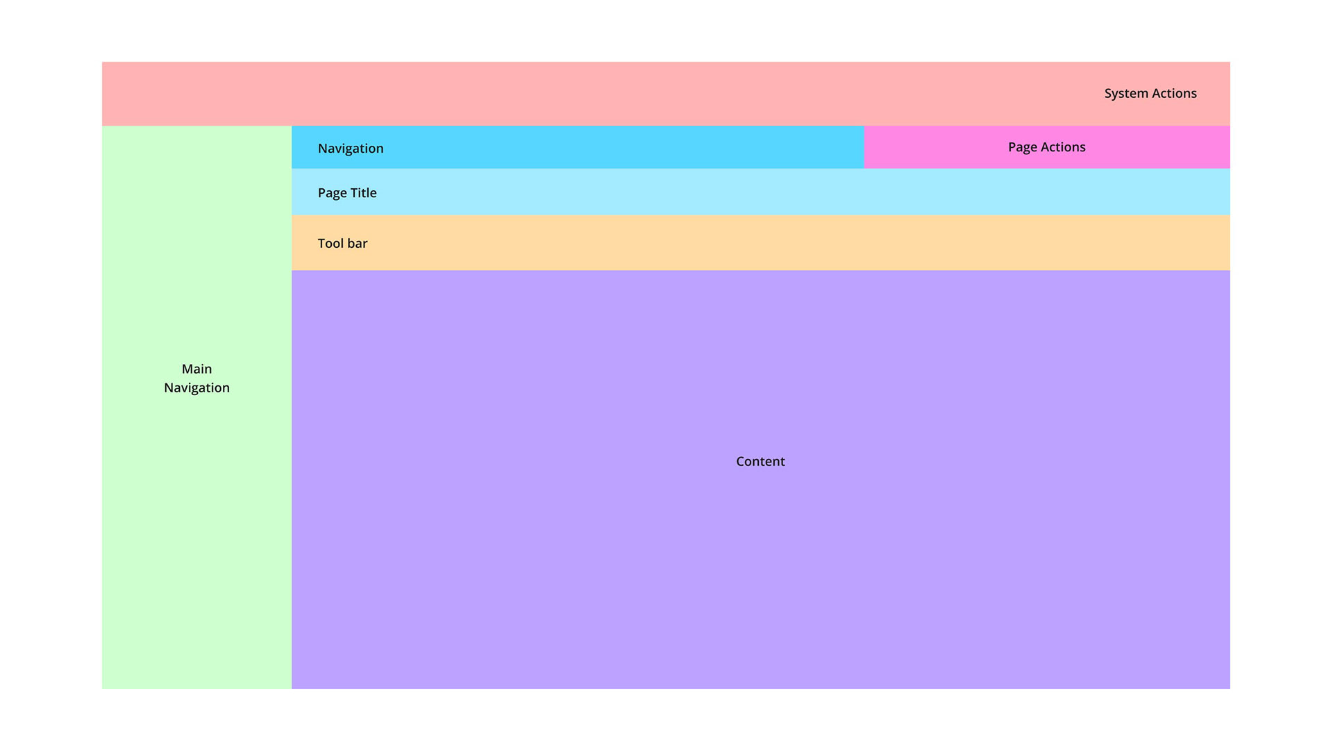
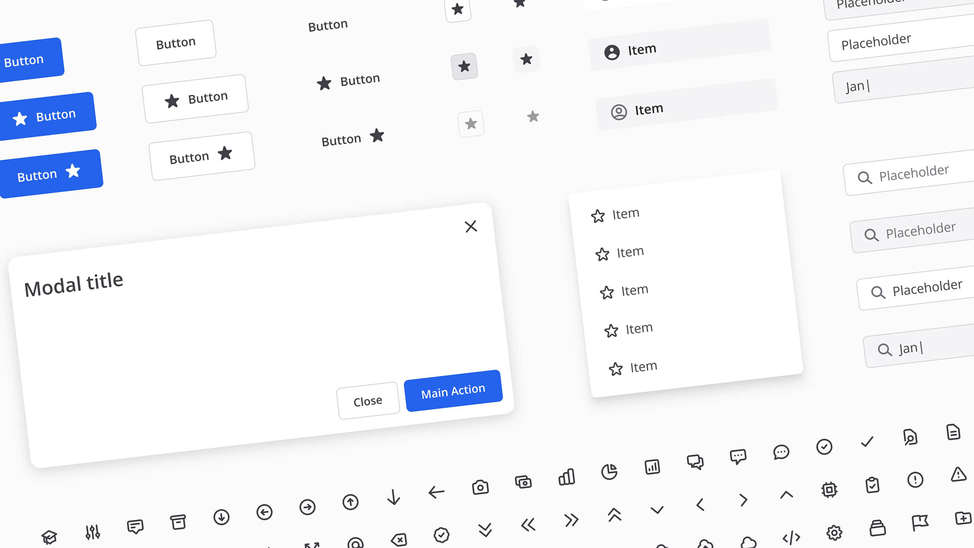
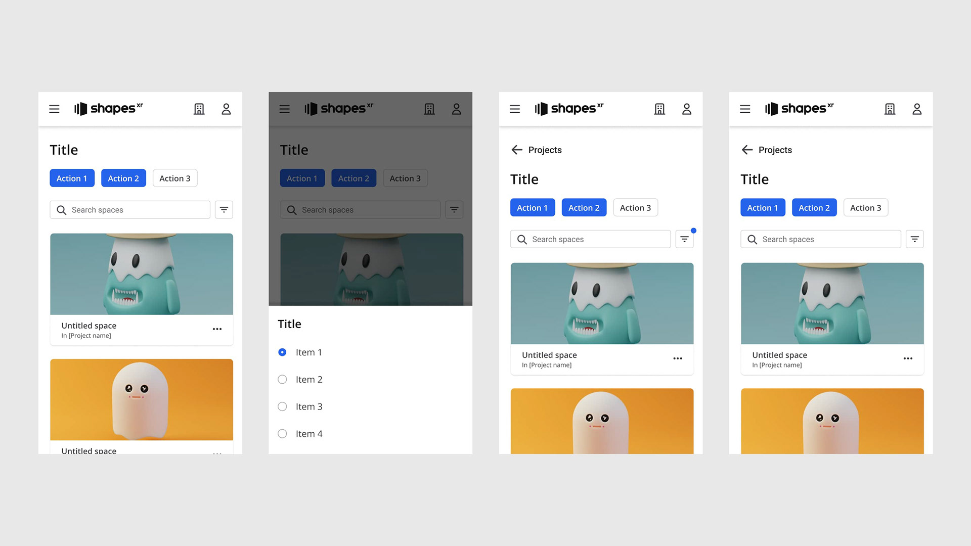
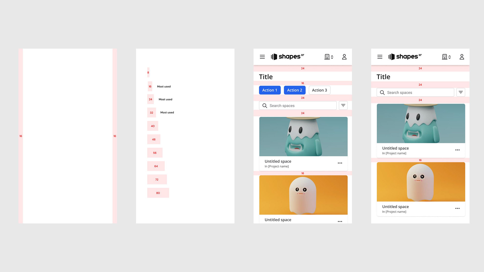
We had an existing UI framework in place and, in collaboration with the front-end team, opted not to replace it but to address and fix its issues. This approach allowed us to narrow down the project scope while still achieving optimal results. The UI strategy involved a complete overhaul of the compoenents while rectifying inconsistencies. I accomplished this by crafting new foundations and subsequently developing new components, enabling us to achieve a modern and pixel-perfect UI.
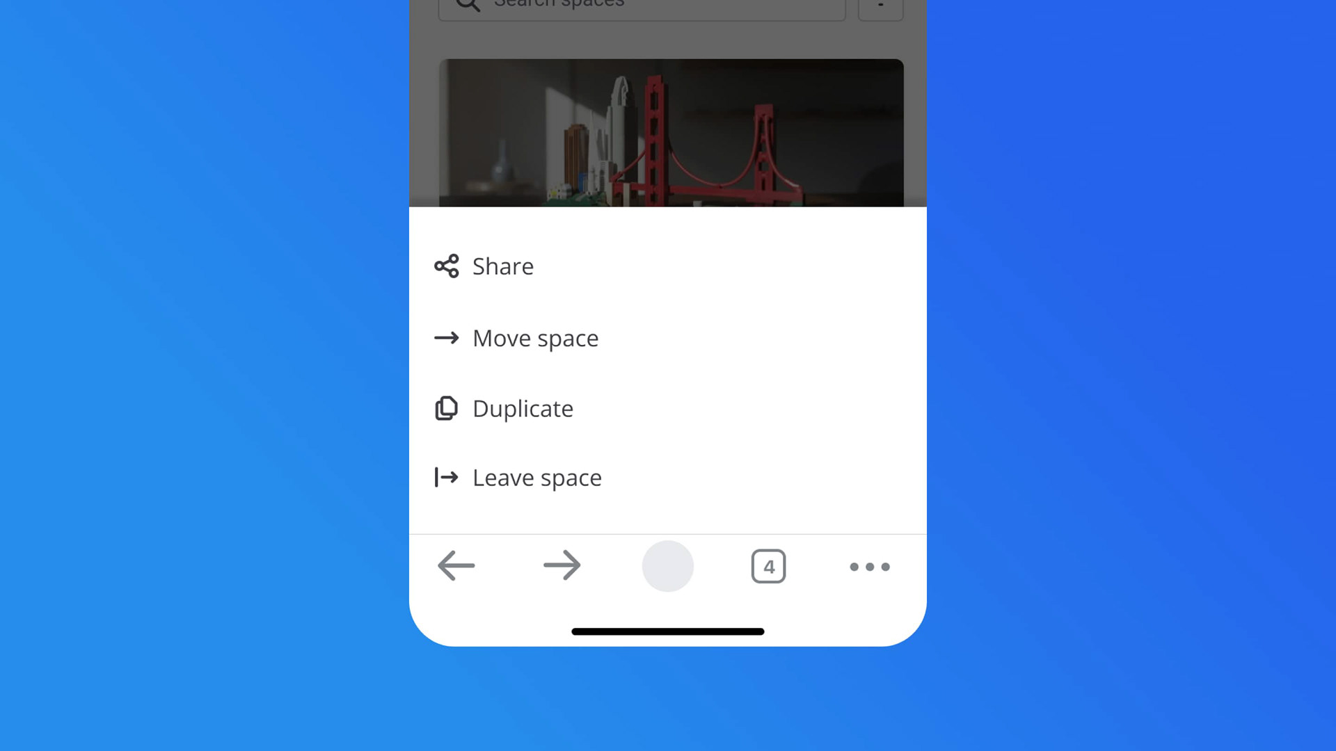
In terms of UX, I established solid navigation patterns and implemented a notification system. On the other hand I created a new information architecture so the core functionalities were easily discoverable.


Results
After the release, the Dashboard became usable on both desktop and mobile devices. The number of imported assets increased by 30%, and there was a 10% weekly increase in retention for mobile users.
On the other hand, as a team, we experienced increased efficiency. The design system, in alignment with the code, enabled us to work faster by utilizing existing components rather than creating them from scratch every time a new feature needed implementation
Design Process
I addressed the problem by creating an inventory of all the pages, accompanied by a new information architecture. Following that, I conducted a heuristic evaluation to identify and prioritize issues in collaboration with the team.
Concerning the UI, I compiled an inventory of all existing components. Aligned with the front-end team, we opted not to change the UI framework but instead improve the current one.
Once the design system was established, I began designing all the new screens and conducted user testing on features such as the file uploading system. Simultaneously, I worked on designing the mobile version of the entire app.
Finally, I prepared the handoff for developers, encompassing all user flows and UI specifications.
Thank you for reading! 💙